
36.1: Reading - Descriptive Statistics and Graphing
- Page ID
- 111553
\( \newcommand{\vecs}[1]{\overset { \scriptstyle \rightharpoonup} {\mathbf{#1}} } \)
\( \newcommand{\vecd}[1]{\overset{-\!-\!\rightharpoonup}{\vphantom{a}\smash {#1}}} \)
\( \newcommand{\id}{\mathrm{id}}\) \( \newcommand{\Span}{\mathrm{span}}\)
( \newcommand{\kernel}{\mathrm{null}\,}\) \( \newcommand{\range}{\mathrm{range}\,}\)
\( \newcommand{\RealPart}{\mathrm{Re}}\) \( \newcommand{\ImaginaryPart}{\mathrm{Im}}\)
\( \newcommand{\Argument}{\mathrm{Arg}}\) \( \newcommand{\norm}[1]{\| #1 \|}\)
\( \newcommand{\inner}[2]{\langle #1, #2 \rangle}\)
\( \newcommand{\Span}{\mathrm{span}}\)
\( \newcommand{\id}{\mathrm{id}}\)
\( \newcommand{\Span}{\mathrm{span}}\)
\( \newcommand{\kernel}{\mathrm{null}\,}\)
\( \newcommand{\range}{\mathrm{range}\,}\)
\( \newcommand{\RealPart}{\mathrm{Re}}\)
\( \newcommand{\ImaginaryPart}{\mathrm{Im}}\)
\( \newcommand{\Argument}{\mathrm{Arg}}\)
\( \newcommand{\norm}[1]{\| #1 \|}\)
\( \newcommand{\inner}[2]{\langle #1, #2 \rangle}\)
\( \newcommand{\Span}{\mathrm{span}}\) \( \newcommand{\AA}{\unicode[.8,0]{x212B}}\)
\( \newcommand{\vectorA}[1]{\vec{#1}} % arrow\)
\( \newcommand{\vectorAt}[1]{\vec{\text{#1}}} % arrow\)
\( \newcommand{\vectorB}[1]{\overset { \scriptstyle \rightharpoonup} {\mathbf{#1}} } \)
\( \newcommand{\vectorC}[1]{\textbf{#1}} \)
\( \newcommand{\vectorD}[1]{\overrightarrow{#1}} \)
\( \newcommand{\vectorDt}[1]{\overrightarrow{\text{#1}}} \)
\( \newcommand{\vectE}[1]{\overset{-\!-\!\rightharpoonup}{\vphantom{a}\smash{\mathbf {#1}}}} \)
\( \newcommand{\vecs}[1]{\overset { \scriptstyle \rightharpoonup} {\mathbf{#1}} } \)
\( \newcommand{\vecd}[1]{\overset{-\!-\!\rightharpoonup}{\vphantom{a}\smash {#1}}} \)
A. How do you summarize data?
Data is summarized in two main ways: summary calculations and summary visualizations
Calculations: What types of measures are used?
To be able to interpret patterns in the data, raw data must first be manipulated and summarized into two categories of measurements: Measures of central tendency and measures of variability. These two categories of measurements encapsulate the first step of scientific inquiry, descriptive statistics.
Measures of central tendency (center) – Provides information of how data cluster around some single middle value. While there are several ways to measure central tendency, the two measures most often used in Ecology are the mean and the median:
- Mean (average) – Sum of all individual values \(({\Sigma}x_{i})\) divided by total number of values in sample/population \({(n)}\). This is the most commonly used measure of central tendency under symmetrical (normal) distribution. It is sensitive to outliers. The sample mean is usually denoted \(\bar{x}\).
- Median – The middle value when the data set is ordered in sequential rank. This is commonly used when data is skewed and is resistant to outliers. Notice that if there is an even number of values, the median is calculated by adding the middle two values, and dividing by 2 :
for an odd number of values, ranked smallest to largest: 1, 3, 3, 6, 7, 8, 9. The median is 6.
for an even number of values, ranked smallest to largest: 1, 2, 3, 4, 5, 6, 7, 9. The median is \((4+5) \div 2 \ = 4.5\).
- Mode – The most frequently occurring value in the sample. This is less often used in Ecology.
Measures of variability (spread) – Describes how spread out or dispersed the data are. There are two main measures of spread used in biological inquiry:
- Range – Quantifies the distance between the largest and smallest data values.
- Standard deviation – Quantifies the variation or dispersion from the average of a dataset. A low standard deviation indicates that the data tends to be very close to the mean; a high standard deviation indicates that the data points are spread out over a large range of values. This calculation is sensitive to outliers. The standard deviation of a sample is denoted with a lower case s and is calculated as follows:
\[s=\sqrt{\frac{\left(x_{i}-\bar{x}\right)^{2}}{n-1}}\]
Notice that the numerator in the formula for the standard deviation includes the term \((x_{i}-\bar{x})\) which measures how far each individual value \((x_{i})\) is from the sample mean \(\bar{x}\). If the data are highly dispersed/variable, some of these values will be larger, and hence the standard deviation will be large.
- Standard error (SE) – Quantifies how different the sample mean (the average of the data values you have) is likely to be from the mean for the whole population mean (i.e., what you are trying to estimate). It tells you how much the sample mean would vary if you were to repeat a study using new samples from within a single population. The standard error is calculated by dividing the standard deviation by the square root of the sample size:
\[{SE}=\frac{s}{\sqrt{n}}\]
Visualizing the data: How are tables and graphs used?
After all desired descriptive statistics are calculated, they are typically visually summarized into either a table or graph.
Tables:
A table is a set of data values arranged into columns and rows. Typically the columns encompass a broad data category, and the rows encompass another. Within each broad category, there are subcategories that determine how many columns and rows the table consists of. Tables are used to both collect and summarize data. However, most of the time when tables are presented, they consist of summarized data, not raw data. Although tables allow summarized data to be presented in an orderly manner, most people prefer to translate tables into the more powerful data visualization tool, a graph.
Graphs:
A graph is a diagram showing the relation between variable quantities, typically of two variables, each measured along one of a pair of axes at right angles. Graphs can look like a chart or drawing. Most graphs use bars, lines, or parts of a circle to display data. However, there are sometimes when graphs are overlaid on top of maps to also display geographical location, or are even animated to be interactive.
Major graph type categories:
- Circle/Pie – A circular chart divided into slices to illustrate numerical proportion. In a pie chart, the arc length of each slice (and consequently its central angle and area), is proportional to the quantity it represents. While it is named for its resemblance to a pie that has been sliced, there are variations on the way it can be presented.
- Line – A type of chart which displays information as a series of data points called 'markers' connected by straight line segments. It is a basic type of chart common in many fields. It is similar to a scatter plot except that the measurement points are ordered in sequence (typically by their x-axis value) and joined with straight line segments. A line chart is often used to visualize a trend in data over intervals of time – a time series – thus the line is often drawn chronologically.
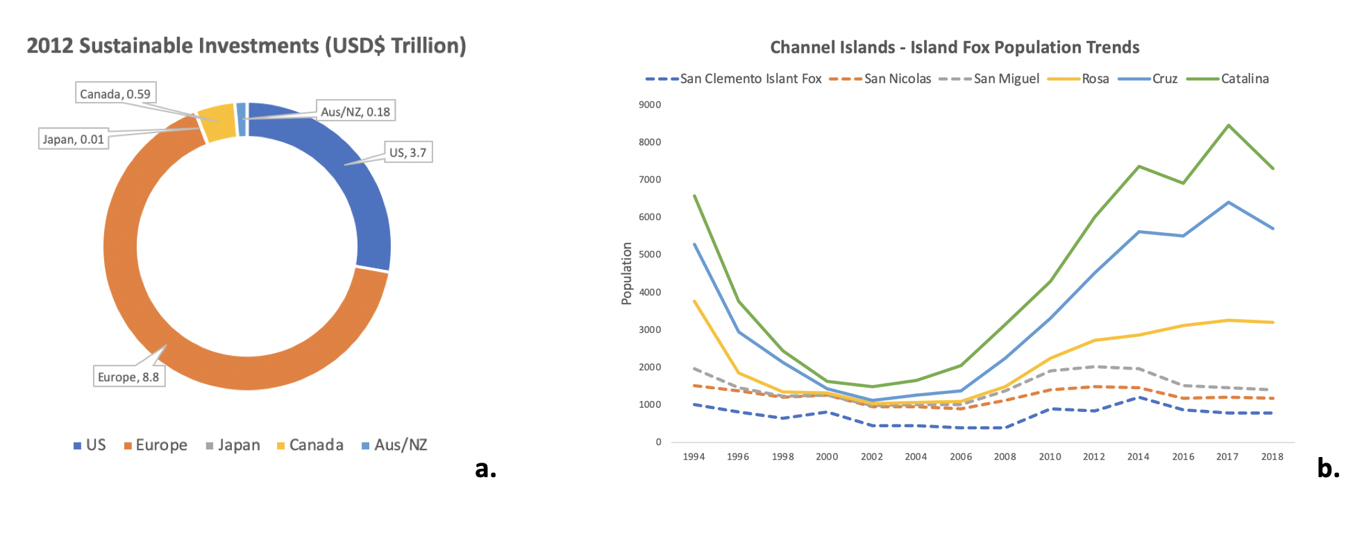
Figure \(\PageIndex{1}\): Examples of a circle/pie graph (a.) and a line graph (b.). Image created by Rachel Schleiger (CC-BY-NC).
- Scatter plot – Is a graph in which the values of two variables are plotted along the horizontal and vertical axes, the pattern of the resulting points revealing any correlation preset. The data are displayed as a collection of points, each having the value of one variable determining the position on the horizontal axis and the value of the other variable determining the position on the vertical axis.
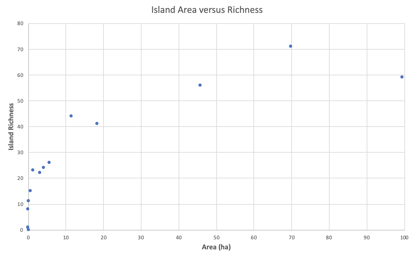
Figure \(\PageIndex{2}\): Example of a scatter plot. Image created by Rachel Schleiger (CC-BY-NC).
- Bar – A chart or graph that presents categorical data with rectangular bars with heights or lengths proportional to the values that they represent. The bars can be plotted vertically or horizontally.
- Histogram – Is an approximate representation of the distribution of numerical data. To construct a histogram, the first step is to "bin" (or "bucket") the range of values—that is, divide the entire range of values into a series of intervals—and then count how many values fall into each interval. The bins are usually specified as consecutive, non-overlapping intervals of a variable. The bins (intervals) must be adjacent (meaning there are not spaces between them like there are in bar graphs), and are often (but not required to be) of equal size. If the bins are of equal size, a rectangle is erected over the bin with height proportional to the frequency—the number of cases in each bin.
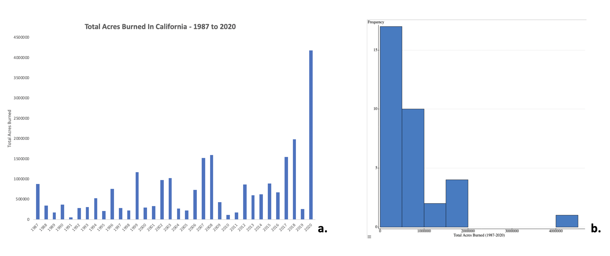
Figure \(\PageIndex{3}\): Examples of a bar graph (a.) and a histogram (b.) using the same dataset. Image created by Rachel Schleiger (CC-BY-NC).
Characteristics of effective graphical displays
The greatest value of a picture is when it forces us to notice what we never expected to see.
Graphics reveal data. Indeed graphics can be more precise and revealing than conventional statistical computations."[3]
In his 1983 book The Visual Display of Quantitative Information, Edward Tufte defines 'graphical displays' and principles for effective graphical display in the following passage: "Excellence in statistical graphics consists of complex ideas communicated with clarity, precision, and efficiency.
Professor Tufte explained that users of information displays are executing particular analytical tasks such as making comparisons. The design principle of the information graphic should support the analytical task.[1] As William Cleveland and Robert McGill show, different graphical elements accomplish this more or less effectively. For example, dot plots and bar charts outperform pie charts.[12]
Graphical displays should:
- show the data
- induce the viewer to think about the substance rather than about methodology, graphic design, the technology of graphic production, or something else
- avoid distorting what the data has to say
- present many numbers in a small space
- make large data sets coherent
- encourage the eye to compare different pieces of data
- reveal the data at several levels of detail, from a broad overview to the fine structure
- serve a reasonably clear purpose: description, exploration, tabulation, or decoration
- be closely integrated with the statistical and verbal descriptions of a data set.
Explore data visualizations at from data to viz.
- techatstate (7 August 2013). "Tech@State: Data Visualization - Keynote by Dr Edward Tufte". Archived from the original on 29 March 2017. Retrieved 29 November 2016 – via YouTube.
- leveland, W. S.; McGill, R. (1985). "Graphical perception and graphical methods for analyzing scientific data". Science. 229 (4716): 828–33. Bibcode:1985Sci...229..828C. doi:10.1126/science.229.4716.828. PMID 17777913. S2CID 16342041.
- Tufte, Edward (1983). The Visual Display of Quantitative Information. Cheshire, Connecticut: Graphics Press. ISBN 0-9613921-4-2. Archived from the original on 2013-01-14. Retrieved 2019-08-10.
Attribution (Section A)
Rachel Schleiger (CC-BY-NC) and Data Visualization From Wikipedia, the free encyclopedia, modified by Andy Wilson.
B. What is a hypothesis and are there different kinds?
Biological (Scientific) hypothesis: An idea that proposes a tentative explanation about a phenomenon or a narrow set of phenomena observed in the natural world. This is the backbone of all scientific inquiry! As such it is important to have a solid biological hypothesis before moving forward in the scientific method (i.e. procedures, results, discussion). After the creation of a solid biological hypothesis, it can then be simplified into a statistical hypothesis (as defined below) that will become the basis for how the data will be analyzed and interpreted.
Statistical hypotheses: After defining a strong biological hypothesis, a statistical hypothesis can be created based on what you will predict will be the measured outcome(s) (dependent variable(s)). If a study has multiple measured outcomes there can be multiple statistical hypotheses. Each statistical hypothesis will have two components (Null and Alternative).
- Null hypothesis (Ho) –This hypothesis states that there is no relationship (or no pattern) between the independent and dependent variables.
- Alternative hypothesis (H1) – This hypothesis states that there is a relationship (or is a pattern) between the independent and dependent variables.
Independent versus dependent variables: For both biological and statistical hypotheses there should be two basic variables defined:
- Independent (explanatory) variable – It is usually what phenomena you think will affect the measure you are interested in (dependent variable).
- Dependent (response) variable – A dependent variable is what you measure in the experiment and what is affected during the experiment. The dependent variable responds to (depends on) the independent variable. In a scientific experiment, you cannot have a dependent variable without an independent variable.
Example
Yellow-billed Cuckoo nests were counted during breeding season in degraded, restored, and intact riparian habitats to see overall habitat preference for nesting sites increased with habitat health.
- Scientific hypothesis: Yellow-billed Cuckoo will have habitat preferences because of habitat health/status.
- Statistical hypotheses: (Ho) There will be no differences in number of nests between habitats with different health/status. (H1) There will be more nests in restored and intact habitats compared to degraded.
- Independent variable = Habitat health/status
- Dependent variable = Number of nests counted
C. How do you reach conclusions?
Finally, after defining the biological hypothesis, statistical hypothesis, and collecting all your data, a researcher can begin statistical analysis. A statistical test will mathematically “test” your data against the statistical hypothesis. The type of statistical test that is used depends on the type and quantity of variables in the study, as well as the question the researcher wants to ask. After computing the statistical test, the outcome will indicate which statistical hypothesis is more likely. This, in turn indicates to scientists what level of inference can be gained from the data compared to the biological hypothesis (the focus point of the study). Then a conclusion can be made based on the sample about the entire population. It is important to note that the process does not stop here. Scientists will want to continue to test this conclusion until a clear pattern emerges (or not) or to investigate similar but different questions.
D. Types of Basic Statistical Tests
Inferential statistics generally provide a test statistic, the degrees of freedom (related to the number of individuals in each sample) and a p-value. Significance (acceptance of the alternative hypothesis) is generally based on the p-value. Depending on the field, scientists will often use a cut-off of 0.01 or 0.05 to determine significance. If the test returns a p-value that is less than this value, the relationship is deemed significant.
- Chi-Square – Are two categorical variables related?
- (e.g. do different habitats different in the numbers of species of each type?)
- T-Test – Does the mean (continuous data) of one group (a categorical variable) differ from the mean of another group?
- (e.g. are oak trees taller than hickory trees, on average?)
- ANOVA – Does the mean of several groups differ? A post-hoc test is used to run pairwise comparisons if so
- (e.g. does height differ across tree species, on average?)
- Linear regression - Are two continuous variables linearly related?
- (e.g. do taller trees have a larger circumference?)
E. The “Magic” level of Significance
If p ≤ 0.05 – accept alternative hypothesis
- There is less than 5% chance that the samples are from the same population
- There is a significant difference between the samples
If p > 0.05 – accept null hypothesis
- There is no significant difference between the samples
Attribution (Sections B - E)
Rachel Schleiger (CC-BY-NC)