
1.6: Gene Expression Analysis
- Page ID
- 185743

\( \newcommand{\vecs}[1]{\overset { \scriptstyle \rightharpoonup} {\mathbf{#1}} } \)
\( \newcommand{\vecd}[1]{\overset{-\!-\!\rightharpoonup}{\vphantom{a}\smash {#1}}} \)
\( \newcommand{\dsum}{\displaystyle\sum\limits} \)
\( \newcommand{\dint}{\displaystyle\int\limits} \)
\( \newcommand{\dlim}{\displaystyle\lim\limits} \)
\( \newcommand{\id}{\mathrm{id}}\) \( \newcommand{\Span}{\mathrm{span}}\)
( \newcommand{\kernel}{\mathrm{null}\,}\) \( \newcommand{\range}{\mathrm{range}\,}\)
\( \newcommand{\RealPart}{\mathrm{Re}}\) \( \newcommand{\ImaginaryPart}{\mathrm{Im}}\)
\( \newcommand{\Argument}{\mathrm{Arg}}\) \( \newcommand{\norm}[1]{\| #1 \|}\)
\( \newcommand{\inner}[2]{\langle #1, #2 \rangle}\)
\( \newcommand{\Span}{\mathrm{span}}\)
\( \newcommand{\id}{\mathrm{id}}\)
\( \newcommand{\Span}{\mathrm{span}}\)
\( \newcommand{\kernel}{\mathrm{null}\,}\)
\( \newcommand{\range}{\mathrm{range}\,}\)
\( \newcommand{\RealPart}{\mathrm{Re}}\)
\( \newcommand{\ImaginaryPart}{\mathrm{Im}}\)
\( \newcommand{\Argument}{\mathrm{Arg}}\)
\( \newcommand{\norm}[1]{\| #1 \|}\)
\( \newcommand{\inner}[2]{\langle #1, #2 \rangle}\)
\( \newcommand{\Span}{\mathrm{span}}\) \( \newcommand{\AA}{\unicode[.8,0]{x212B}}\)
\( \newcommand{\vectorA}[1]{\vec{#1}} % arrow\)
\( \newcommand{\vectorAt}[1]{\vec{\text{#1}}} % arrow\)
\( \newcommand{\vectorB}[1]{\overset { \scriptstyle \rightharpoonup} {\mathbf{#1}} } \)
\( \newcommand{\vectorC}[1]{\textbf{#1}} \)
\( \newcommand{\vectorD}[1]{\overrightarrow{#1}} \)
\( \newcommand{\vectorDt}[1]{\overrightarrow{\text{#1}}} \)
\( \newcommand{\vectE}[1]{\overset{-\!-\!\rightharpoonup}{\vphantom{a}\smash{\mathbf {#1}}}} \)
\( \newcommand{\vecs}[1]{\overset { \scriptstyle \rightharpoonup} {\mathbf{#1}} } \)
\(\newcommand{\longvect}{\overrightarrow}\)
\( \newcommand{\vecd}[1]{\overset{-\!-\!\rightharpoonup}{\vphantom{a}\smash {#1}}} \)
\(\newcommand{\avec}{\mathbf a}\) \(\newcommand{\bvec}{\mathbf b}\) \(\newcommand{\cvec}{\mathbf c}\) \(\newcommand{\dvec}{\mathbf d}\) \(\newcommand{\dtil}{\widetilde{\mathbf d}}\) \(\newcommand{\evec}{\mathbf e}\) \(\newcommand{\fvec}{\mathbf f}\) \(\newcommand{\nvec}{\mathbf n}\) \(\newcommand{\pvec}{\mathbf p}\) \(\newcommand{\qvec}{\mathbf q}\) \(\newcommand{\svec}{\mathbf s}\) \(\newcommand{\tvec}{\mathbf t}\) \(\newcommand{\uvec}{\mathbf u}\) \(\newcommand{\vvec}{\mathbf v}\) \(\newcommand{\wvec}{\mathbf w}\) \(\newcommand{\xvec}{\mathbf x}\) \(\newcommand{\yvec}{\mathbf y}\) \(\newcommand{\zvec}{\mathbf z}\) \(\newcommand{\rvec}{\mathbf r}\) \(\newcommand{\mvec}{\mathbf m}\) \(\newcommand{\zerovec}{\mathbf 0}\) \(\newcommand{\onevec}{\mathbf 1}\) \(\newcommand{\real}{\mathbb R}\) \(\newcommand{\twovec}[2]{\left[\begin{array}{r}#1 \\ #2 \end{array}\right]}\) \(\newcommand{\ctwovec}[2]{\left[\begin{array}{c}#1 \\ #2 \end{array}\right]}\) \(\newcommand{\threevec}[3]{\left[\begin{array}{r}#1 \\ #2 \\ #3 \end{array}\right]}\) \(\newcommand{\cthreevec}[3]{\left[\begin{array}{c}#1 \\ #2 \\ #3 \end{array}\right]}\) \(\newcommand{\fourvec}[4]{\left[\begin{array}{r}#1 \\ #2 \\ #3 \\ #4 \end{array}\right]}\) \(\newcommand{\cfourvec}[4]{\left[\begin{array}{c}#1 \\ #2 \\ #3 \\ #4 \end{array}\right]}\) \(\newcommand{\fivevec}[5]{\left[\begin{array}{r}#1 \\ #2 \\ #3 \\ #4 \\ #5 \\ \end{array}\right]}\) \(\newcommand{\cfivevec}[5]{\left[\begin{array}{c}#1 \\ #2 \\ #3 \\ #4 \\ #5 \\ \end{array}\right]}\) \(\newcommand{\mattwo}[4]{\left[\begin{array}{rr}#1 \amp #2 \\ #3 \amp #4 \\ \end{array}\right]}\) \(\newcommand{\laspan}[1]{\text{Span}\{#1\}}\) \(\newcommand{\bcal}{\cal B}\) \(\newcommand{\ccal}{\cal C}\) \(\newcommand{\scal}{\cal S}\) \(\newcommand{\wcal}{\cal W}\) \(\newcommand{\ecal}{\cal E}\) \(\newcommand{\coords}[2]{\left\{#1\right\}_{#2}}\) \(\newcommand{\gray}[1]{\color{gray}{#1}}\) \(\newcommand{\lgray}[1]{\color{lightgray}{#1}}\) \(\newcommand{\rank}{\operatorname{rank}}\) \(\newcommand{\row}{\text{Row}}\) \(\newcommand{\col}{\text{Col}}\) \(\renewcommand{\row}{\text{Row}}\) \(\newcommand{\nul}{\text{Nul}}\) \(\newcommand{\var}{\text{Var}}\) \(\newcommand{\corr}{\text{corr}}\) \(\newcommand{\len}[1]{\left|#1\right|}\) \(\newcommand{\bbar}{\overline{\bvec}}\) \(\newcommand{\bhat}{\widehat{\bvec}}\) \(\newcommand{\bperp}{\bvec^\perp}\) \(\newcommand{\xhat}{\widehat{\xvec}}\) \(\newcommand{\vhat}{\widehat{\vvec}}\) \(\newcommand{\uhat}{\widehat{\uvec}}\) \(\newcommand{\what}{\widehat{\wvec}}\) \(\newcommand{\Sighat}{\widehat{\Sigma}}\) \(\newcommand{\lt}{<}\) \(\newcommand{\gt}{>}\) \(\newcommand{\amp}{&}\) \(\definecolor{fillinmathshade}{gray}{0.9}\)What is gene expression analysis?
The mere DNA sequence is not the end of the story as we transmit biological information from DNA to ultimately make proteins. The DNA has to be "expressed" (aka, mRNA has to be made), and then that mRNA has to be read to create a protein. Gene expression analysis measures the amount of mRNA made for a particular gene in a particular sample. Measuring this amount tells us if the gene is turned "on" or "off" (aka whether or not the protein that the gene codes for is actually made in that sample), and also how much protein can potentially be made in that sample. We can use this information to, for example, differentiate between cell types, understand the functions of particular genes, and diagnose diseases related to gene expression.
Basic Strategy
The basic strategy of gene expression analysis is described in the figure below:
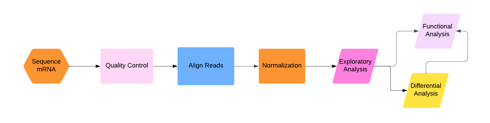.png?revision=1)
First, we have to actually sequence the mRNA using RNA sequencing. This process is much more complicated than DNA sequencing for two major reasons:1) RNA is a much less stable molecule than DNA and 2) we actually want to know the amount of RNA in the sample (as opposed to DNA sequencing, when we are usually just looking for the sequence and don't care how many reads there are of each part as long as there are enough of them).
Second, quality control. Experiments are not perfect, and you don't want to work with garbage. So throw out the really bad reads. (Note: some people put this step after alignment, and some people put this step in with normalization. The reality is that you should probably be checking for quality of your data and the success of your analyses at each step.)
Third, once we have the mRNA sequenced, we have to align those sequences to the DNA sequence. This part is basically the same as what we saw in Chapter CHAPTER, though in the section discussing this part, I will go over what the current industry standard method is and why it is particularly good for RNA-seq data.
At this point, you would think you might have a pretty good idea of which parts of the DNA are being expressed, and how much (more mRNA reads aligned to one part of the DNA sequence means that that part is expressed more, right?)
No! Fourth, we have to do a bunch of normalization and adjustment for statistical and experimental variation! This is the most complicated part of the whole process.
Finally, we can do the fun stuff: analyzing the data. I will discuss three steps of this process: exploratory analysis (aka do a PCA), differential analysis (aka compare expression levels across different samples directly), and functional enrichment analysis (aka what "types" of genes are highly expressed in the sample?). I have arranged these three types of analysis at the end of the flowchart above in a strange-looking way; my opinion is that you should always do exploratory analysis first, and then from there you can go straight to functional analysis (if you are not comparing across multiple samples), straight to differential analysis (if you explicitly want to compare multiple samples), or differential analysis and then functional analysis (if you want to compare multiple samples and then use gene ontology information to characterize that comparison).
Getting your mRNA sequences
RNA is much less stable than DNA, and mRNA is single-stranded (which means that unless there's a lot of molecular machinery already floating around to handle it it can bind to itself and be very difficult to sequence). So, the first step in getting mRNA sequences is actually turning them back into DNA using reverse transcriptase. The first time you do this, you create a strand of DNA that is complementary to the mRNA strand, which is why this is called cDNA (or complementary DNA). Now you have a double-stranded molecule, one strand of which is mRNA and one strand of which is cDNA. You then have to heat it all up a bit to detach the mRNA from the cDNA, and then reverse transcriptase will create a new strand of DNA that is complementary to the cDNA (which therefore matches the original mRNA sequence) and now you have double-stranded cDNA that contains the original mRNA sequence and its complement. What you do with it after this is outside the scope of the class, as are the details of this process in general, but you can find out more here.
The old-school thing to do once you have your cDNA is to use a microarray (a grid of targets) and have your cDNA bind to specific target sequences in your microarray. The amount of cDNA that binds to your target sequences allows you to quantify how much cDNA of that sequence. Now, I'm using "quantify" a bit generously here. Microarray data comes in the form of images, where each specific target sequence has a particular spot on an array that glows more if there is more binding. The measurement of gene expression levels from microarrays is literally just measuring how bright different target sequences are. You can compare relative brightness, but there is a limit to how much quantifiable information you can actually get from a microarray experiment, and early on it was almost impossible to standardize experimental practices in order to create reproducible results (see Box BOX). Things are better now, and there are circumstances where microarray analysis is useful for gene expression analysis, but for the remainder of this chapter I will focus on the "modern" way of doing this: RNA-seq. For RNA-seq, you basically just create a cDNA library from your sample, and then sequence that cDNA using DNA sequencing techniques. The difficult part is quantifying the reads. In DNA sequencing, you normally just care about read depth to the extent that you have enough coverage to be confident in your sequencing. For RNA sequencing, the specific number of reads that map to a particular gene is actually important, and depends strongly on the experiment itself. We'll get to how we manage that, but first, let's actually align and assemble the cDNA reads.
One thing I didn't mention previously about making cDNA is: there's a ton of different kinds of RNA in a cell, and the vast majority of it is not mRNA (most of it is rRNA, and there is also a bunch of non-coding (nc) RNA). How do we isolate mRNA?
- Consider the structure of mRNA. Is there one obvious part that is unlikely to be found in other RNA sequences?
- rRNA is extremely highly conserved across organisms (aka the sequence doesn't change much). How can we use this to remove rRNA from the sample?
- Which method do you have to use in prokayotes?
- Answer
-
- The poly-A tail.
- You can create small DNA probes that match rRNA sequences (because we basically know exactly what all rRNA sequences look like).
- Prokaryotes do not put poly-A tails on their mRNA, so you have to go with the second method: removing rRNA.
Quality Control
The quality control for RNA-seq is essentially the same as it is for DNA-seq, which I discussed in Chapter 3.
Aligning and Assembling Reads
Once you have your raw RNA-seq data---the individual reads---you have to figure out what genes they come from. To explain how to do this, I'll go through the method for one of the more common tools used for this purpose: Bowtie. Note that the newer method Bowtie 2 is better-suited for modern sequencing methods that generate longer reads, and so if you are actually doing this I'd recommend using Bowtie 2. The algorithm is more complicated and beyond the scope of this class, so I'm using Bowtie here instead.
We have discussed alignment techniques before in Chapter 5. Bowtie is an algorithm that is specifically good at aligning very short reads to very long reference sequences (which is what the general mapping of RNA-seq reads entails) and also allows for large gaps in the middle of the mapping of individual reads (which is very useful for RNA-seq because the reads lack introns, which the reference genome still have, so you necessarily expect big gaps in the middle of your read alignments).
The first thing Bowtie does is "index" the reference genome. Instead of brute-force searching throughout the whole reference genome for each read, it transforms and stores the sequence in a special way that makes it much easier to find where a short read can potentially align. To do this, it uses an algorithm call the Burrows-Wheeler transformation.
Burrows-Wheeler Transformation
The Burrows-Wheeler (BW) transformation is a method that takes a string (a sequence of characters, or letters, or bases in this case) and rearranges all the letters in a way that makes it
- Easier to store in memory
- Possible to reconstruct the entire original string perfectly
This is a process that is called lossless compression. If you've ever seen a .zip file, that's an example of lossless compression; all the information is stored in a way that takes up less space and is unusable until you decompress it, but when you do decompress it you get all of that information back.
Consider the string AAAAAAAAA.
1. How might you write this string (using only letters and numbers) in a way that keeps all the information but takes up less space?
Now consider the string ACTAGCCAA.
2. Use the method you found in Q1 to "compress" this string. How successful was that compression?
- Answer
-
1. 9A (or A9, but this is a slightly worse way to do it because you have to backtrack to recover the original string). Congratulations! You have just discovered a compression technique called run-length encoding!
2. ACTAG2C2A (or ACTA2G2CA ). Same number of characters, so this compression wasn't very good. Compression works best when there are a lot of repeated characters in a row.
The Burrows-Wheeler transform itself is so simple you can do it by hand! First, let's start with a string, say POTATO. For technical reasons, we need a unique character that isn't in the string at one or both ends of the string; typically people use "$", and it is typically at the end of string. So let's call the string POTATO$. The first thing to do is to take the last character of the string and put it at the front, and then repeat until you've gone all the way around:
POTATO$
$POTATO
O$POTAT
TO$POTA
ATO$POT
TATO$PO
OTATO$P
Now we sort these rearrangements in lexicographical order (aka alphabetical order but with a defined ordering of non-alphabetical symbols; in this case we only need to say that "$" comes either before or after the alphabet. For this example I chose "before".). And then we read off the last letter of each of these sorted rearrangements (in bold) , and that's our transform.
$POTATO
ATO$POT
O$POTAT
OTATO$P
POTATO$
TATO$PO
TO$POTA
So our BW transform of POTATO$ is OTTP$OA. Notice how the two Ts are grouped together. If your string has a lot of repeated complex patterns, these groupings will occur frequently in this transformation, and so we can compress it better than the original string.
Find the Burrows-Wheeler transform of MISSISSIPPI$.
- Answer
-
IPSSM$PISSII
OK well we mixed up our string in a weird way. Now what? Well, as it turns out, the actual string isn't that important; it's the process of getting that string that gives us a useful tool.
The first thing I should say is that I am going to do all the next steps by inspecting the sorted list from the BWT, but the point of this algorithm is that there are nice mathematical formulas for computing these things that we are going to do visually.
Let's take a look at this list, which is the key part of the BWT
$POTATO
ATO$POT
O$POTAT
OTATO$P
POTATO$
TATO$PO
TO$POTA
Let's say I wanted to count all occurrences of the pattern "TATO" in my string. Luckily, this list is ordered alphabetically and uniquely, so every occurrence of that pattern is going to be right next to every other occurrence. We start by doing something bizarre: start with the last letter. (I'll show you why this is important in a second). So, how many occurrences are there of the pattern "O"? Then "TO"? Then "ATO"? Then "TATO"? I'll put this in a table for ease of reading:
| O | TO | ATO | TATO |
| $POTATO ATO$POT O$POTAT OTATO$P POTATO$ TATO$PO TO$POTA |
$POTATO ATO$POT O$POTAT OTATO$P POTATO$ TATO$PO TO$POTA |
$POTATO ATO$POT O$POTAT OTATO$P POTATO$ TATO$PO TO$POTA |
$POTATO ATO$POT O$POTAT OTATO$P POTATO$ TATO$PO TO$POTA |
Luckily, in this case there is only one "TATO", so we can align that sequence perfectly. To actual get the location of "TATO" in the original string you have to do another (relatively) simple calculation to reverse the BWT.
Now why did we go through that whole rigmarole of starting with the last letter? Take a look at the number of matches. We started with 2, then we had 1, then 1, then 1. In fact, this process has the property that the number of matches never increases as you go from the end to the beginning! So the instant we got to "TO", we could have stopped, because "TO" is unique and has only one occurrence, and so if we know where "TO" is, we know where "TATO" is. An important thing in all of these algorithms is that you want to make them as efficient as possible, as we are dealing with very large strings and very large sequences. If you can stop before you have to go through all possible choices, then you stop.
Now, for a large sequence, this list of ordered permutations is also large, but all of the information in this list is encoded in the BWT. So we can take the BWT string, do some simple mathematical operations on it, and perform the same procedure I just showed you visually in this example. I keep saying "simple" here and I mean it; you basically just construct a few tables by counting and then look up numbers in those tables.
Using the ordered list of permutations, count how many occurrences there are of "ISSI" in MISSISSIPPI$. Did you have to go through all four letters, or could you have stopped earlier? Explain why.
- Answer
-
There are two (obviously), but in this case you did have to go through all of them because there was more than one.
So that's an efficient method for finding exact matches in short strings. But what about mutations or sequencing errors? Well, Bowtie allows for this by backtracking. Let's try to align the sequence "TOTO":
| O | TO | OTO | TOTO |
| $POTATO ATO$POT O$POTAT OTATO$P POTATO$ TATO$PO TO$POTA |
$POTATO ATO$POT O$POTAT OTATO$P POTATO$ TATO$PO TO$POTA |
$POTATO ATO$POT O$POTAT OTATO$P POTATO$ TATO$PO TO$POTA |
$POTATO ATO$POT O$POTAT OTATO$P POTATO$ TATO$PO TO$POTA |
Oops! We can't! There is no exact match. What Bowtie does in this situation is it backtracks, so it stops, substitutes a random letter, and tries again. In this case, if it substituted "A" for the problem letter (that "O"), then it would find a match and align "TOTO" with the "TATO" part of "POTATO", with a slight penalty for having to make a substitution.
Notice I haven't said anything about gaps yet. That's because Bowtie doesn't directly address gaps; it assumes the reads are short enough that you don't cross a full intron with them. TopHat (built on top of Bowtie...get it?) and Bowtie 2, on the other hand, explicitly handle gaps caused by introns.
Once the reads are aligned, you have to assemble them into transcripts. This process is similar to what we saw in Chapter CHAPTER, but easier because you've already aligned stuff and also more difficult because you have to take into account alternative splicing. An example of a program that does this is Cufflinks.
Normalization
There are number of potential problems that occur when we do RNA-seq that we don't necessarily have to worry about for DNA-seq, mostly because we care about the actual amount of reads that map to particular parts of the genome. These problems include:
- Longer genes will get more reads mapped to them
- There is no real baseline control for gene expression (i.e. all genes are expressed differently everywhere)
- Different experimental conditions can lead to more or less mRNA produced and sequenced overall
To combat these problems, there are several different normalization techniques.
Correcting for Gene Length Bias
The most common measure for correcting for gene length bias is RPKM. This stands for "reads per kilobase per million mapped reads". So, you take the number of reads that map to a particular transcript, divide that by the length of that gene in kilobases (thus normalizing for gene length) and then divide that by how many million reads were mapped to the genome in total (thus normalizing for overall sequencing depth/success).
So, if out of 4 million total mapped reads, 96 mapped to a transcript for Gene A, and that gene is 3kb long, then \( RPKM = \frac{96}{4\times 3} = 8\).
If you have paired-end reads (see Chapter CHAPTER), then you can have either two paired reads that map to the same fragment (which would be double-counted by RPKM) or one read that maps to a fragment and the other read fails to map. So if you count fragments instead of reads, that solves the potential double-counting problem and you get FPKM, or "fragments per kilobase per million mapped reads".
It will be easier for me to explain TPM (transcripts per kilobase per million mapped reads) if I start writing out equations. Call the number of reads for a particular transcript "j" \(r_j\), and the length of gene "j" \(\ell_j\). Then, we compute RPKM of gene "j" as:
\[ RPKM_j = 10^9 \frac{r_j}{\ell_j} \frac{1}{\sum_{i=1}^N r_i}.\]
So we normalize for gene length and normalize for sequencing depth in some sense "simultaneously", without considering the possibility that sequencing depth can potentially affect the relationship between the number of mapped reads and gene length. We can write TPM as follows:
\[ TPM_j = 10^6\frac{r_j}{\ell_j} \frac{1}{\sum_{i=1}^N \frac{r_i}{\ell_i}}\ = 10^6 \frac{RPKM_j}{\sum_{i=1}^N RPKM_i} .\]
Basically what TPM does is it normalizes the RPKM value of a single gene by the total RPKM value of all genes.
So, which one to use? As it turns out, none of these simple methods of normalization are very good. Why? Well, first of all, comparing these values across samples assumes that you have the same amount of total RNA, which is generally fine if you do your experiments carefully, under the same conditions, at the same time, but not guaranteed. Also, all of these methods correct for sequencing depth but no other potential variation between samples or experiments. Modern techniques like those used by the common software packages limma, DESeq2, and edgeR, rely on looking at the whole distribution of reads instead of making simplifying assumptions like RPKM and TPM do. Furthermore, there is recent debate that with the cost of RNA-seq decreasing, we don't have to rely on fancy normalization techniques if we just design our experiments properly, with replicates and large sample sizes. At any rate, people still use these values and these packages all the time, so the exercise below is about computing RPKM and TPM, and the R activity for this chapter will use DESeq2. Because different methods will give you different results, I would recommend using multiple packages on the same data if you do an actual analysis.
The following table contains data from a hypothetical experiment where RNA-seq was performed on samples from 3 different tissues for three different genes. The units are in millions of reads (this is a very fake dataset!) Fill out the RPKM and TPM values in this table and answer the following questions:
| Gene | Gene Length | Heart | Brain | Lungs | RPKM Heart |
RPKM Brain | RPKM Lungs | TPM Heart | TPM Brain | TPM Lungs |
|---|---|---|---|---|---|---|---|---|---|---|
| Gene A | 10 kb | 1.2 | 1.2 | 0.4 | ||||||
| Gene B | 150 kb | 0.5 | 3.4 | 2 | ||||||
| Gene C | 75 kb | 1.1 | 0.02 | 0.9 |
- Which gene is most highly expressed in each tissue (use RPKM)?
- Which tissue is each gene most highly expressed in (use RPKM)?
- Do your results change when you use TPM? If so, explain why. If not, explain why not.
- Answer
| Gene | Gene Length | Heart | Brain | Lungs | RPKM Heart |
RPKM Brain | RPKM Lungs | TPM Heart | TPM Brain | TPM Lungs |
|---|---|---|---|---|---|---|---|---|---|---|
| Gene A | 10 kb | 1.2 | 1.2 | 0.4 | 0.043 | 0.026 | 0.012 | 0.87 | 0.84 | 0.61 |
| Gene B | 150 kb | 0.5 | 3.4 | 2 | 0.0012 | 0.005 | 0.004 | 0.024 | 0.16 | 0.2 |
| Gene C | 75 kb | 1.1 | 0.02 | 0.9 | 0.0052 | 5.8e-05 | 0.0036 | 0.11 | 0.002 | 0.18 |
- Heart: A, Brain: A, Lungs: A
- A: Heart, B: Brain, C: Heart
- Yes! TPM switches B and C both to Lungs. This is because the total RPKM for Lungs is smaller than that for Brain, so dividing by that will increase the Lung values potentially over the Brain values.
Controlling for Batch Effects
A "batch effect" is anything that differs from one experiment to the next. We don't necessarily know what a particular batch effect is, we just know that if we do different experiments, something about the experiments might be different. Maybe its the incubation temperature, maybe its where you put the flask on the table, maybe its airflow turbulence patterns, maybe its the amount of coffee the scientist had before performing the experiment. This is why it's best practice to try to do all your experiments at once in as consistent an environment as possible. Batch effects are, in general, however, unavoidable, so it's good to check for them and correct for them.
The basic idea behind correcting for batch effects is a variance partition: the response variable you are measuring (gene expression in this case) varies in your data. Some of that variation is due to the stuff you are testing (e.g. treatment vs control), and some of it is due to random noise. Some of it could also be because of batch effects. In general, you can take the amount of variation in your response variable and partition it among the possible sources of variation (including the effect you are studying); this type of calculation is called a variance partition and is used across sciences. The first step in correcting for batch effects is seeing how bad they are: that is, how much of the observed variation is due to batch effects as opposed to the treatment effect?
An R package that can be used to control for batch effects is BatchQC, which incorporates two of the popular control methods: COMBAT and COMBAT-seq. The following example is from an example dataset in the BatchQC package (the "Bladderbatch" dataset). This dataset consists of 57 bladder samples with 5 batches. There are 3 types of samples (cancer, biopsy, control). Batch 1 contains only cancer, 2 has cancer and controls, 3 has only controls, 4 contains only biopsy, and 5 contains cancer and biopsy. It is important to consider experimental setups like this because sometimes you have to do different treatments in different batches for logistical purposes. If so, it is crucial that you don't have perfect matching between treatments and batches, or else it would be impossible to isolate batch effects from treatment effects.
Analyzing Gene Expression Data (Finally!)
Exploratory Analysis
The first thing you should do whenever you get any data is: plot it. Visualize it somehow. See if it makes sense. Gene expression data is no different. Unfortunately, it is "high-dimensional", which means you can't just plot it on a graph with two axes. Typically, we use PCA (see Chapter CHAPTER: Additional Methods) to visualize these data.
The figures in this section are from data from this study, which looked at gene expression in two types of tissue (fat and brain) in the Eastern bumble bee Bombus impatiens, comparing situations where the bees were exposed to toxic heavy metals (arsenic, cadmium, chromium, and lead) to those that weren't. Here is a PCA of all samples, colored by the tissue they came from, with the observations for the PCA being the individual (normalized) gene expression values.
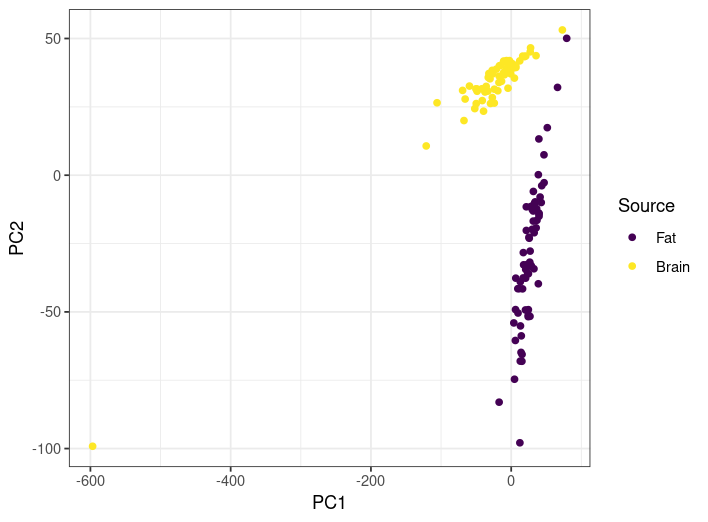
- Does the PCA here provide a good sanity check that the samples from different tissues have different gene expression profiles? Explain why or why not.
- Are there any samples you would want to look at more closely to see if everything worked correctly? If so, which ones? Explain your choice.
- Answer
-
- In general, yes. The two tissue types are well-separated by the PCA. The fact that the results appear to lie on a line for each is a bit weird, ad there appears to be significant variation of gene expression profiles within tissue type, but I would say yeah this at least looks fine.
- The one crazy brain one on the bottom left is a huge outlier, so that one is worth checking. In addition, the two closest fat and brain ones are worth checking as well.
Another thing you can do is try to cluster the data using a formal clustering method. Let's see how k-means clustering (Chapter CHAPTER: Additional Techniques) groups the samples in this dataset (here I have set k=2 because we know we have two different sources):
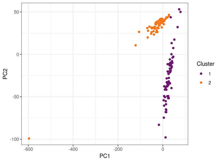
How well do the clusters match the source? Does this make you feel good or bad about the results?
Answer
-
Almost perfectly! In fact, here is a "contingency" table, which shows correct results as well as errors:
Cluster 1 Cluster 2 Brain 3 57 Fat 67 0 That's a pretty good separation!
Differential Expression Analysis
Now that we have quantified our gene expression, we might want to compare expression of different genes across samples. Are some genes more or less expressed in different samples? The most basic way to do this is to look at fold change, which is just how much bigger one value is than another in a ratio. For example, 10 is two-fold bigger than 5 because 10/2 = 5. Similarly, 5 is 0.25-fold bigger (or 4-fold smaller) than 20, because 5/0.25 = 20. So if you take, say, the RPKM value (btw don't do this! use a normalized count from a software package instead!) for one gene from one sample and divide it by the RPKM value from one gene from another sample, you get the "fold-change" of expression between samples. Now, if you want to scale this to a particular multiple (usually 2), then you take the log2 of the ratio. So the 2-fold change between 2 and 10 is 1, and the 2-fold change between 20 and 5 is -2. Taking the log like this is preferable to using absolute ratios because 1) no change leads to a value of 0 and 2) you can interpret the number in units of doubling.
Fill out this table by computing the 2-fold change of expression from heart to brain tissues of each gene:
| Gene | Heart | Brain | 2-Fold Change |
| Gene A | 1.2 | 1.2 | |
| Gene B | 0.5 | 3.4 | |
| Gene C | 1.1 | 0.02 |
- Answer
-
Gene Heart Brain 2-Fold Change Gene A 1.2 1.2 0 Gene B 0.5 3.4 2.77 Gene C 1.1 0.02 -41
Now, there is a huge problem with stopping here: we aren't taking into account any randomness or error! We need some statistics!
Let's go back to count normalization, because now we're going to be doing what the package DESeq2 does.
The DESeq2 method of normalization uses the following steps:
- Compute the geometric mean of total raw counts across all samples for each gene. The geometric mean is the nth root of the product of n numbers. So the geometric mean of 5, 8, 2, and 4 is \((5\times8\times2\times)^\frac{1}{4} = 4.23\). Note that if you have a count of 0 anywhere, you will get a 0 for this number. That's ok, we'll deal with that in a later step. This number is called a pseudoreference.
- Compute the ratio of each sample count to this pseudoreference.
- Take the median of all these ratios across each gene for each sample. This is where you throw out the ones with the 0s, as they would have 0 psuedoreference and therefore an infinite ratio, so we get rid of those. The result is called the normalization factor.
- Divide the raw counts by the corresponding normalization factor for each sample.
Why do we go through this whole procedure? We are now actually using a statistical model instead of just making stuff up. The basic idea of the model is that
- Most genes are not differentially expressed across samples.
- The distribution of expression of genes in a sample is overdispersed, meaning that there are more extreme values than you would expect from a normal distribution.
The specific distribution used by DESeq2 and edgeR is the negative binomial distribution, as this exhibits overdispersion, but that's not the only possible choice.
Suppose a gene is expressed approximately the same across samples. Then the pseudoreference will be approximately equal to its count number in each sample. The ratio in step 2 would be approximately equal to 1, and most genes would be around this value. Thus, when you take the median in step 3, that median will also usually be around 1 no matter what the extreme outliers in differential expression are. The normalization factor would then be...you guessed it! Around 1, so the normalized counts would be similar to the original counts. But if there is generally lower (or higher) read depth for a particular sample (not specific to a particular gene, but the whole sample), then the normalization factor will be a little bit lower or higher than 1, respectively, and that will adjust the raw counts to account for sequencing depth.
Repeat this exercise but compute the normalized counts (NC) using the DESeq2 method and answer the following questions (ignore gene length):
| Gene | Heart | Brain | Lungs | Psuedoreference | Heart/Pseudoreference | Brain/Psuedoreference | Lungs/Psuedoreference | Heart NC | Brain NC | Lungs NC |
| Gene A | 1.2 | 1.2 | 0.4 | |||||||
| Gene B | 0.5 | 3.4 | 2 | |||||||
| Gene C | 1.1 | 0.02 | 0.9 | |||||||
| Normalization factor |
- Which gene is most highly expressed in each tissue?
- Which tissue is each gene most highly expressed in?
- Answer
| Gene | Heart | Brain | Lungs | Psuedoreference | Heart/Pseudoreference | Brain/Psuedoreference | Lungs/Psuedoreference | Heart NC | Brain NC | Lungs NC |
| Gene A | 1.2 | 1.2 | 0.4 | 0.83 | 1.45 | 1.45 | 0.48 | 1 | 1 | 0.36 |
| Gene B | 0.5 | 3.4 | 2 | 1.5 | 0.33 | 2.27 | 1.33 | 0.23 | 2.34 | 1.5 |
| Gene C | 1.1 | 0.02 | 0.9 | 0.27 | 4.07 | 0.074 | 3.33 | 0.76 | 0.014 | 0.68 |
| Normalization Factor | 1.45 | 1.45 | 1.33 |
- Heart: A, Brain: A, Lungs: B
- A: Heart and Brain, B: Brain, C: Heart
The actual statistical model used by DESeq2 and edgeR looks basically like this:
\[ K_{ij} ~ NB(s_jq_{ij}, \alpha_i) \]
So that looks like nonsense. Let me explain. Kij is the raw count of gene "i" in sample "j". The "~" means "is distributed as", and the NB stands for the negative binomial distribution. The negative binomial distribution has two parameters and in this case they are the mean (the first one) and a measure of how spread out the distribution is (the second one). In Chapter CHAPTER: Additional Techniques, I have an interactive app that you can use to see how changing these parameters changes the shape of the distribution. Anyways, sj is the normalization factor from step 3, $\alpha_i$ measures how variable the counts are across samples for gene "i" (and is estimated from data), and qij is proportional to the "true" amount of cDNA in the same for that gene. Now, qij is further broken down as follows: \(q_{ij} = 2^{x_j\beta_{i}}\), where xj is the experimental condition (so it could be "treatment" or "control", if you're only studying one thing) and \(\beta_i\) is the 2-fold change between the treatment and control (if you are comparing multiple different things, the meaning of this quantity is slightly different).
So! What do you do with all that? You take your actual counts, you estimate your normalization and dispersion factors from the overall data, and then you fit this model to get those $\beta_i$ values. This technique will also get you p-values for each estimated fold change. A p-value is the probability that you would get an equivalent or more dramatic fold change under the null model where the treatment had no effect (aka the parameter xj has no effect; you can compute this by taking the distribution you get using all the fitted parameters but setting all x values to be equal, and seeing what the probability is that you get your same result under that model. This is not what they do; they do a form of t-test called a Wald test, but I'm not going to go into that here. The point is you get a p-value.).
And you get a p-value for every gene for each sample. Now comes the most boring but super important part of these types of large-scale hypothesis testing.
Multiple Testing Corrections
A p-value of 0.05 means that even if there was no effect of the treatment on gene expression at all, 5% of the time I would detect an effect.
Suppose there is in fact no effect of the treatment.
If I'm just doing one test, then 95% of the time (assuming there is no effect of the treatment) I'd see no effect, and go "ok well let's try something else". Now, if I re-did the experiment 100 times to fish for a result and got 5 false positives over those hundred experiments and chose to report only those 5 to the scientific community, that would be bad practice. In fact it would be research fraud, and if people found out I'd be (hopefully) blackballed from the scientific community.
But! If I test 1000 genes for an effect in a single experiment, I'd get 50 results! I would get super excited and go report my findings to the scientific community! Look, I found 50 genes that might do something under this treatment! And then others would try to replicate my results, get nothing, go look at my paper, see that I didn't adjust for the fact that I did many many tests at once, and then I'd (hopefully) have to retract my paper, embarrassed.
So, when you perform many different tests on the same hypothesis on the same data, you have to use a different level of scrutiny for what constitutes "statistically significant" so that you don't accidentally get excited and think you found something when you very likely did not.
The easiest, most brutal, most "conservative" (aka least likely to give you a false positive) way to do this is called the Bonferroni correction. This one is simple; instead of a significance level of, say, 0.05, you just divide that significance level by the total number of tests you are doing. So in the above example, if I did 1000 genes, my new significance level is 0.05/1000 = 0.00005, and I'll call any result with a p-value below that new value "statistically significant". In this case, under the assumption that there is no effect of the treatment, I would now expect to get 1 false positive in my entire experiment only 5% of the time (as opposed to 50 false positives every time)! What we have effectively done here is turn the false-positive rate of an individual test into the false positive rate of the entire experiment. This is the safest way to make this correction; when in doubt, do this.
However! In many cases, the Bonferroni correction is too strict. I mean, one false positive in my entire experiment only 5% of the time? That probably means I'm getting a lot of false negatives; I'm throwing away potential discoveries just to make sure I don't report any false ones. Perhaps it would be better to, instead of worrying only about false positives, worry about false discoveries instead.
\[ \text{False positive rate} = \frac{\text{False positives}}{\text{False positives} + \text{True negatives}}\]
\[ \text{False discovery rate} = \frac{\text{False positives}}{\text{False positives} + \text{True positives}}\]
Controlling for the False Discovery Rate (FDR) is less stringent than controlling for the false positive rate (or Type-I Error Rate, or significance level, they're all the same), but it focuses on the stuff you are planning to report out to the scientific community anyways and means that you throw away fewer potential true positives in an effect to minimize the false ones.
The most common way to control for the FDR is the Benjamini-Hochberg (BH) procedure, which is actually kind of fun to calculate.
Let's start with p-values 0.001, 0.002, 0.2, 0.1, 0.5, 0.25, 0.02, 0.025, 0.015, 0.8 and a significance level of 0.05.
| 1. Sort the P-values | 0.001 | 0.002 | 0.01 | 0.03 | 0.04 | 0.1 | 0.2 | 0.25 | 0.5 | 0.8 |
| 2. Multiply by the number of samples* | 0.01 | 0.02 | 0.1 | 0.3 | 0.4 | 1 | 2 | 2.5 | 5 | 8 |
| Rank | 1 | 2 | 3 | 4 | 5 | 6 | 7 | 8 | 9 | 10 |
| 3. Divide by rank | 0.01 | 0.01 | 0.033 | 0.075 | 0.08 | 0.167 | 0.29 | 0.3125 | 0.56 | 0.8 |
| *this is equivalent to the Bonferroni correction; instead of dividing the significance level and comparing the p-values to it, you are multiplying the p-values and comparing them to the old significance level |
For the Bonferroni correction, we compare the results in step 2 to 0.05, and for the BH procedure we compare the results from step 3 to 0.05.
For the above example, how many tests are statistically significant
- Unadjusted?
- Under the Bonferroni correction?
- Under the BH procedure?
- Answer
-
- 5 (0.001, 0.002, 0.01, 0.03, 0.04)
- 2 (0.01, 0.02)
- 3 (0.01, 0.01, 0.033)
OK, we'll finish off this section with an exercise that could be the output of a Differential Expression analysis
Perform p-value adjustments on the rest of this table and indicate which genes show a significant fold-change difference for the treatment vs the control for a significance level of 0.03.
| Gene | Control | Treatment | 2-Fold Change | P-value | Bonferroni p-value | BH p-value |
| Gene A | 10 | 2 | 0.02 | |||
| Gene B | 1067 | 1264 | 0.0045 | |||
| Gene C | 25 | 972 | 0.001 | |||
| Gene D | 82 | 70 | 0.03 |
- Answer
-
Gene Control Treatment 2-Fold Change P-value Bonferroni p-value BH p-value Gene A 10 2 -2.3 0.02 0.08 0.027 Gene B 1067 1264 0.24 0.0045 0.018 0.009 Gene C 25 972 5.3 0.001 0.004 0.004 Gene D 82 70 -0.23 0.03 0.12 0.03
Functional Enrichment Analysis
Once you know what genes are expressed differently in different samples, it is useful to know what they are! The typical way to do this is to find the GO or KEGG annotations and then see if there are certain annotations that are overrepresented in the differentially expressed genes. This essentially amounts to a statistics problem. The most basic way to approach this is to use Fisher's Exact Test in a method called Overrepresentation Analysis (ORA). To do this, you basically have to fill out a contingency table. Let's say that out of 5000 total genes, there are 500 differentially expressed genes. Of the DE genes, 10 are related to fat storage (for instance) and the others are not. Of the non-DE genes, 60 are related to fat storage, and the others are not. The table looks like this:
| Gene Differentially Expressed | Gene Not Differentially Expressed | |
| Gene Related to Fat Storage | A = 10 | B = 60 |
| Gene Not Related to Fat Storage | C = 490 | D = 4440 |
Fisher's Exact Test provides the probability that you observe at least 10 of the class of interest (DE and related to fat storage) by chance; that is, is there an increased association between fat storage and DE than you would expect by chance. It's exact because we can compute the exact probability (it's a hypergeometric distribution). In fact, here is the equation, where N=A+B+C+D
\[ \frac{\binom{A+C}{A}\binom{B+D}{B}}{\binom{N}{A+B}} \]
Luckily, we don't have to compute this by hand. Remember to adjust for multiple comparisons!
There are other approaches that do not use this technique and instead focus on the rank of the gene in terms of its DE level, not necessarily the exact amount. Gene Set Enrichment Analysis (GSEA) was the first one to do this. A common one nowadays is clusterProfiler, an R package. Here is an example of a clusterProfiler result (from the online manual)

Bar plots like this can show if the annotation was significantly enriched (via coloring by p-value) and how many genes correspond to that annotation. Can you guess what conditions these
Lab Activity
A lab activity called "gene_expression_lab.pdf" is found in the supplemental files for this textbook.