
3.2: Summarizing the data- Descriptive statistics
- Page ID
- 32635

How do you summarize data?
Data is summarized in two main ways: summary calculations and summary visualizations
Calculations: What types of measures are used?
To be able to interpret patterns in the data, raw data must first be manipulated and summarized into two categories of measurements: Measures of central tendency and Measures of variability. These two categories of measurements encapsulate the first step of scientific inquiry, descriptive statistics.
Measures of central tendency (center) – Provides information of how data cluster around some single middle value. There are two measures of center used most often in biological inquiry:
- Mean (average) – Sum of all individual values divided by total number of values in sample/population. This is the most commonly used measure of center under symmetrical distribution and is sensitive to outliers.
- Median – The middle value when the data set is ordered in sequential rank (highest to lowest). This is commonly used when data is skewed and is resistant to outliers.
Measures of variability (spread) – Describes how spread out or dispersed the data are. There are two main measures of spread used in biological inquiry:
- Range – Quantifies the distance between the largest and smallest data values.
- Standard deviation – Quantifies the variation or dispersion from the average of a dataset. A low standard deviation indicates that the data tends to be very close to the mean; a high standard deviation indicates that the data points are spread out over a large range of values. This calculation is sensitive to outliers.
- Standard error – Quantifies the variation in the means from multiple datasets or a sample distribution of your original dataset.
Visualizing the data: How are tables and graphs used?
After all desired descriptive statistics are calculated, they are typically visually summarized into either a table or graph.
Tables:
A table is a set of data values arranged into columns and rows. Typically the columns encompass a broad data category, and the rows encompass another. Within each broad category there are subcategories that determine how many columns and rows the table consists of. Tables are used to both collect and summarize data. However, most of the time when tables are presented, they consist summarized data, not raw data. Although tables allow summarized data to be presented in an orderly manner, most people prefer to translate tables into the more powerful data visualization tool, a graph.
Graphs:
A graph is a a diagram showing the relation between variable quantities, typically of two variables, each measured along one of a pair of axes at right angles. Graphs can look like a chart or drawing. Most graphs use bars, lines, or parts of a circle to display data. However, there are sometimes when graphs are overlaid on top of maps to also display geographical location, or are even animated to be interactive.
Major graph type categories:
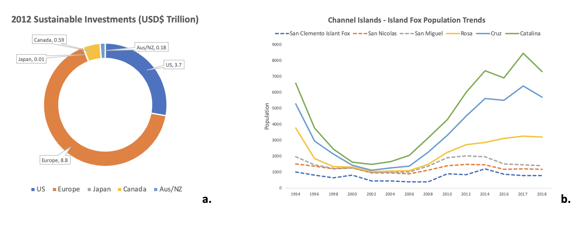
- Circle/Pie – A circular chart divided into slices to illustrate numerical proportion. In a pie chart, the arc length of each slice (and consequently its central angle and area), is proportional to the quantity it represents. While it is named for its resemblance to a pie which has been sliced, there are variations on the way it can be presented.
- Line – A type of chart which displays information as a series of data points called 'markers' connected by straight line segments. It is a basic type of chart common in many fields. It is similar to a scatter plot except that the measurement points are ordered (typically by their x-axis value) and joined with straight line segments. A line chart is often used to visualize a trend in data over intervals of time – a time series – thus the line is often drawn chronologically.
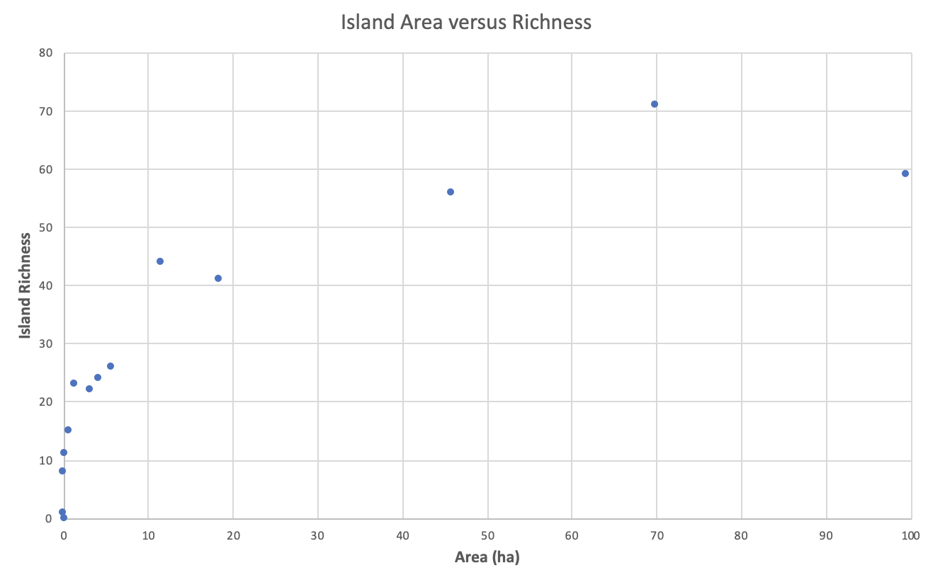
- Scatter plot – Is a graph in which the values of two variables are plotted along the horizontal and vertical axes, the pattern of the resulting points revealing any correlation preset. The data are displayed as a collection of points, each having the value of one variable determining the position on the horizontal axis and the value of the other variable determining the position on the vertical axis.
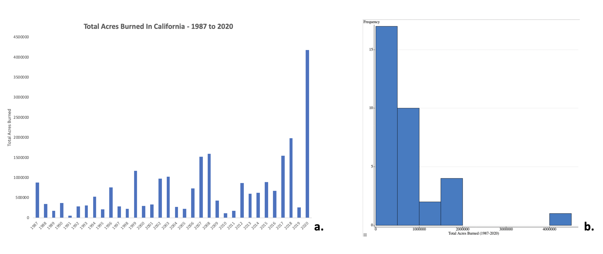
- Bar – A chart or graph that presents categorical data with rectangular bars with heights or lengths proportional to the values that they represent. The bars can be plotted vertically or horizontally.
- Histogram – Is an approximate representation of the distribution of numerical data. To construct a histogram, the first step is to "bin" (or "bucket") the range of values—that is, divide the entire range of values into a series of intervals—and then count how many values fall into each interval. The bins are usually specified as consecutive, non-overlapping intervals of a variable. The bins (intervals) must be adjacent (meaning there are not spaces between them like there are in bar graphs), and are often (but not required to be) of equal size. If the bins are of equal size, a rectangle is erected over the bin with height proportional to the frequency—the number of cases in each bin.
Attribution
Rachel Schleiger (CC-BY-NC)