
15.2: The SIR flowchart
- Page ID
- 25513

\( \newcommand{\vecs}[1]{\overset { \scriptstyle \rightharpoonup} {\mathbf{#1}} } \)
\( \newcommand{\vecd}[1]{\overset{-\!-\!\rightharpoonup}{\vphantom{a}\smash {#1}}} \)
\( \newcommand{\dsum}{\displaystyle\sum\limits} \)
\( \newcommand{\dint}{\displaystyle\int\limits} \)
\( \newcommand{\dlim}{\displaystyle\lim\limits} \)
\( \newcommand{\id}{\mathrm{id}}\) \( \newcommand{\Span}{\mathrm{span}}\)
( \newcommand{\kernel}{\mathrm{null}\,}\) \( \newcommand{\range}{\mathrm{range}\,}\)
\( \newcommand{\RealPart}{\mathrm{Re}}\) \( \newcommand{\ImaginaryPart}{\mathrm{Im}}\)
\( \newcommand{\Argument}{\mathrm{Arg}}\) \( \newcommand{\norm}[1]{\| #1 \|}\)
\( \newcommand{\inner}[2]{\langle #1, #2 \rangle}\)
\( \newcommand{\Span}{\mathrm{span}}\)
\( \newcommand{\id}{\mathrm{id}}\)
\( \newcommand{\Span}{\mathrm{span}}\)
\( \newcommand{\kernel}{\mathrm{null}\,}\)
\( \newcommand{\range}{\mathrm{range}\,}\)
\( \newcommand{\RealPart}{\mathrm{Re}}\)
\( \newcommand{\ImaginaryPart}{\mathrm{Im}}\)
\( \newcommand{\Argument}{\mathrm{Arg}}\)
\( \newcommand{\norm}[1]{\| #1 \|}\)
\( \newcommand{\inner}[2]{\langle #1, #2 \rangle}\)
\( \newcommand{\Span}{\mathrm{span}}\) \( \newcommand{\AA}{\unicode[.8,0]{x212B}}\)
\( \newcommand{\vectorA}[1]{\vec{#1}} % arrow\)
\( \newcommand{\vectorAt}[1]{\vec{\text{#1}}} % arrow\)
\( \newcommand{\vectorB}[1]{\overset { \scriptstyle \rightharpoonup} {\mathbf{#1}} } \)
\( \newcommand{\vectorC}[1]{\textbf{#1}} \)
\( \newcommand{\vectorD}[1]{\overrightarrow{#1}} \)
\( \newcommand{\vectorDt}[1]{\overrightarrow{\text{#1}}} \)
\( \newcommand{\vectE}[1]{\overset{-\!-\!\rightharpoonup}{\vphantom{a}\smash{\mathbf {#1}}}} \)
\( \newcommand{\vecs}[1]{\overset { \scriptstyle \rightharpoonup} {\mathbf{#1}} } \)
\(\newcommand{\longvect}{\overrightarrow}\)
\( \newcommand{\vecd}[1]{\overset{-\!-\!\rightharpoonup}{\vphantom{a}\smash {#1}}} \)
\(\newcommand{\avec}{\mathbf a}\) \(\newcommand{\bvec}{\mathbf b}\) \(\newcommand{\cvec}{\mathbf c}\) \(\newcommand{\dvec}{\mathbf d}\) \(\newcommand{\dtil}{\widetilde{\mathbf d}}\) \(\newcommand{\evec}{\mathbf e}\) \(\newcommand{\fvec}{\mathbf f}\) \(\newcommand{\nvec}{\mathbf n}\) \(\newcommand{\pvec}{\mathbf p}\) \(\newcommand{\qvec}{\mathbf q}\) \(\newcommand{\svec}{\mathbf s}\) \(\newcommand{\tvec}{\mathbf t}\) \(\newcommand{\uvec}{\mathbf u}\) \(\newcommand{\vvec}{\mathbf v}\) \(\newcommand{\wvec}{\mathbf w}\) \(\newcommand{\xvec}{\mathbf x}\) \(\newcommand{\yvec}{\mathbf y}\) \(\newcommand{\zvec}{\mathbf z}\) \(\newcommand{\rvec}{\mathbf r}\) \(\newcommand{\mvec}{\mathbf m}\) \(\newcommand{\zerovec}{\mathbf 0}\) \(\newcommand{\onevec}{\mathbf 1}\) \(\newcommand{\real}{\mathbb R}\) \(\newcommand{\twovec}[2]{\left[\begin{array}{r}#1 \\ #2 \end{array}\right]}\) \(\newcommand{\ctwovec}[2]{\left[\begin{array}{c}#1 \\ #2 \end{array}\right]}\) \(\newcommand{\threevec}[3]{\left[\begin{array}{r}#1 \\ #2 \\ #3 \end{array}\right]}\) \(\newcommand{\cthreevec}[3]{\left[\begin{array}{c}#1 \\ #2 \\ #3 \end{array}\right]}\) \(\newcommand{\fourvec}[4]{\left[\begin{array}{r}#1 \\ #2 \\ #3 \\ #4 \end{array}\right]}\) \(\newcommand{\cfourvec}[4]{\left[\begin{array}{c}#1 \\ #2 \\ #3 \\ #4 \end{array}\right]}\) \(\newcommand{\fivevec}[5]{\left[\begin{array}{r}#1 \\ #2 \\ #3 \\ #4 \\ #5 \\ \end{array}\right]}\) \(\newcommand{\cfivevec}[5]{\left[\begin{array}{c}#1 \\ #2 \\ #3 \\ #4 \\ #5 \\ \end{array}\right]}\) \(\newcommand{\mattwo}[4]{\left[\begin{array}{rr}#1 \amp #2 \\ #3 \amp #4 \\ \end{array}\right]}\) \(\newcommand{\laspan}[1]{\text{Span}\{#1\}}\) \(\newcommand{\bcal}{\cal B}\) \(\newcommand{\ccal}{\cal C}\) \(\newcommand{\scal}{\cal S}\) \(\newcommand{\wcal}{\cal W}\) \(\newcommand{\ecal}{\cal E}\) \(\newcommand{\coords}[2]{\left\{#1\right\}_{#2}}\) \(\newcommand{\gray}[1]{\color{gray}{#1}}\) \(\newcommand{\lgray}[1]{\color{lightgray}{#1}}\) \(\newcommand{\rank}{\operatorname{rank}}\) \(\newcommand{\row}{\text{Row}}\) \(\newcommand{\col}{\text{Col}}\) \(\renewcommand{\row}{\text{Row}}\) \(\newcommand{\nul}{\text{Nul}}\) \(\newcommand{\var}{\text{Var}}\) \(\newcommand{\corr}{\text{corr}}\) \(\newcommand{\len}[1]{\left|#1\right|}\) \(\newcommand{\bbar}{\overline{\bvec}}\) \(\newcommand{\bhat}{\widehat{\bvec}}\) \(\newcommand{\bperp}{\bvec^\perp}\) \(\newcommand{\xhat}{\widehat{\xvec}}\) \(\newcommand{\vhat}{\widehat{\vvec}}\) \(\newcommand{\uhat}{\widehat{\uvec}}\) \(\newcommand{\what}{\widehat{\wvec}}\) \(\newcommand{\Sighat}{\widehat{\Sigma}}\) \(\newcommand{\lt}{<}\) \(\newcommand{\gt}{>}\) \(\newcommand{\amp}{&}\) \(\definecolor{fillinmathshade}{gray}{0.9}\)A standard starting point for examining the theory of disease is the “SIR model” (Figure \(\PageIndex{1}\)). In this model individuals are born “susceptible,” into the box marked \(S\) at the left. They may remain there all their lives, leaving the box only upon their ultimate death—marked by the red arrow pointing downward from the box. The label \(\delta\,s\) on this arrow represents the rate of flow from the box—the rate of death of individuals who have never had the disease. The model assumes a per capita death rate of \(\delta\) deaths per individual per time unit. If \(\delta\) = 1/50, then one-fiftieth of the population will die each year. Multiplying by the number of individuals in the box, \(S\), gives the flow out of the box, \(\delta\,S\) individuals per year.
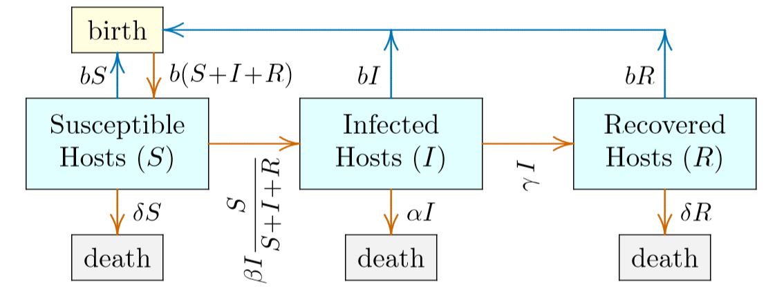
Figure \(\PageIndex{1}\). Flow through an SIR sysytem, a prototypical model of epidemiology.
The only other way out of the \(S\) box is along the red arrow pointing right, indicating susceptible individuals who become infected and move from the left box to the middle box. (The blue arrow pointing up indicates new individuals created by births, not existing individuals moving to a different box.) This rate of flow to the right is more complicated, depending not just on the number of susceptible individuals in the left-hand box but on the number of infected individuals \(I\) in the middle box. In the label on the right-pointing arrow out of the \(S\) box is the infectivity coefficient \(\beta\), the number of susceptible individuals converted by each infected individual per time unit if all individuals in the whole population are susceptible. This is multiplied by the number of individuals who can do the infecting, \(I\), then by the probability that an “infection propagule” will reach and infect someone who is susceptible, \(S\,/\,(S\,+\,I\,+\,R)\). This is just the ratio of the number in the \(S\) box to the number in all boxes combined, and in effect “discounts” the maximum rate \(\beta\). The entire term indicates the number of individuals per time unit leaving the \(S\) box at left and entering the \(I\) box in the middle.
All other flows in Figure \(\PageIndex{1}\) are similar. The virulence symbolized with \(\alpha\) is the rate of death from infected individuals—those in the \(I\) box. This results in \(\alpha\,I\) deaths per year among infected individuals, transferring from the blue \(I\) box to the gray box below it. Note that if infected individuals can also die from other causes, the actual virulence might be more like \(\alpha\,-\delta\), though the situation is complicated by details of the disease. If a disease renders its victims bedridden, for example, their death rate from other causes such as accidents, such as being hit by a train, may be reduced. Such refinements can be addressed in detailed models of specific diseases, but are best not considered in an introductory model like this.
The other way out of the blue \(I\) box in the middle of Figure \(PageIndex{1}\) is by recovery, along the red arrow leading to the blue \(R\) box on the right. In this introductory model, recovered individuals are permanently immune to the disease, so the only exit from the \(R\) box is by death—the downward red arrow—with \(\delta\,R\) recovered individuals dying per year. Note that recovered individuals are assumed to be completely recovered, and not suffering any greater rate of death than susceptible individuals in the \(S\) box (both have the same death rate \(\delta\).) Again, refinements on this assumption can be addressed in more detailed models of specific diseases. The blue arrows represent offspring born and surviving, not individuals leaving one box for another. In this introductory model, all individuals have the same birth rate b, so that being infected or recovering does not affect the rate. The total number of offspring born and surviving is therefore \(b\,(S\,+\,I\,+\,R)\). This is the final red arrow in Figure \(\PageIndex{1}\), placing newborns immediately into the box of susceptible individuals.