
7.3: Hypothetical insect data
- Page ID
- 25458

For a detailed illustration of the methods used in these four graphs and an illustration of population oscillations, consider the hypothetical insect data in Table \(\PageIndex{1}\). Insects often have one-year reproductive cycles; these can be prone to oscillations, and also are known for “outbreaks” (e.g. of disease or of pests). The data in Table \(\PageIndex{1}\) were generated by the difference equation
\[\dfrac{1}{N} \dfrac{∆N}{∆t} = r + sN,\]
with \(r = 3\) and \(s = −4\). The table shows an initial population of about 11,000 individual organisms. The next year there are about 44,000, then 168,000, then more than 500,000, then more than 900,000. But then something apparently goes wrong, and the population drops to just over 55,000. In nature, this might be attributed to harsh environmental conditions—a drastic change in weather or over-exploitation of the environment. But these data are simply generated from a difference equation, with oscillations induced by overshooting the carrying capacity and getting knocked back to different places, again and again, each time the population recovers.
| (A) | (B) | (C) | (D) |
|---|---|---|---|
| t | N | ∆N | ∆I |
| 0 | 11,107 | 32,828 | 2.956 |
| 1 | 43,935 | 124,082 | 2.824 |
| 2 | 168,017 | 391,133 | 2.328 |
| 3 | 559,150 | 426,855 | 0.763 |
| 4 | 986,005 | -930,810 | -0.944 |
| 5 | 55,195 | 153,401 | 2.779 |
| 6 | 208,596 | 451,738 | 2.166 |
| 7 | 660,334 | 236,838 | 0.359 |
| 8 | 897,172 | -528,155 | -0.589 |
| 9 | 369,017 | 562,357 | 1.524 |
| 10 | 931,374 | -675,708 | -0.725 |
| 11 | 255,666 | 505,537 | 1.977 |
| 12 | 761,203 | -34,111 | -0.045 |
| 13 | 727,092 | 66,624 | 0.092 |
| 14 | 793,716 | -138,792 | -0.175 |
| 15 | 654,924 | 249,071 | 0.380 |
| 16 | 903,995 | -556,842 | -0.616 |
| 17 | 347,153 | 559,398 | 1.611 |
| 18 | 906,551 | -567,685 | -0.626 |
| 19 | 338,866 | 557,277 | 1.645 |
| 20 | 896,143 |
The repeated growth and setbacks are visible in the phenomenological graph of population growth (Figure \(\PageIndex{1}\), Part A). It’s easy to see here that the population grows from low levels through year 4, declines drastically in year 5, then rises again and oscillates widely in years 8 through 12. The next four years show smaller oscillations, and in years 16 through 20 there are two sets of nearly identical oscillations.
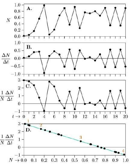
The next phenomenological graph, Part B, shows not the population over time but the change in population over time. The difference in population size from the first year to the following year is about ∆N = 33,000 (44,000 − 11,000 = 33,000). Similarly, the difference in time between years 1 and 2 is just ∆t = 2−1 = 1. So ∆N/∆t is about 33,000/1, or in units of the graph, 0.033 million. Year 0 is therefore marked on the graph vertically at 0.033. Review Chapter 5 for why ∆ is used here rather than dN.
For the second year, the population grows from about 44,000 to about 168,000, so ∆N/∆t = (168,000−44,000)/1 = 124,000, or 0.124 million. Year 1 is therefore marked on the graph vertically at 0.124. This continues for all years, with the exact results calculated in the ∆N column of Table \(\PageIndex{1}\) and plotted in Part B of Figure \(\PageIndex{1}\). These data are still phenomenological, and simply show the annual changes in population levels rather than the population levels themselves.
In Part C we add a bit of biology, showing how many net offspring are produced annually by each individual in the population. This is ∆N/∆t = 33,000/1, the number of new net offspring, divided by about 11,000 parental insects— about three net offspring per insect (more accurately, as shown in the table, 2.956). This can mean that three new insects emerge and the parent lives on, or that four emerge and the parent dies—the model abstracts such details away as functionally equivalent. All such per-insect (per capita) growth rates are calculated in the ∆I column of Table \(\PageIndex{1}\) and plotted in Part C of Figure \(\PageIndex{1}\) Part C shows a little biological information—how the net number of offspring per insect is changing through time, Over the first four years it drops from almost 3 down to almost −1. Again, this could mean that 3 new offspring emerge and survive in year 0 and that the parent survives too, and that by year 4 almost no offspring survive and the parent dies as well. The smallest the change per insect (per capita) can ever be is −1, because that means the individual produces no offspring and dies itself—the worst possible case. And since in this case r = 3, the greatest the change can be per insect is 3— realized most closely when N is very close to 0. In the end, however, even with this touch of biology added to the graph, Part C still oscillates wildly.
The order underlying the chaos finally is revealed in Part D by retaining the biology with per capita growth on the vertical axis, but adding ecology with density N on the horizontal axis. Successive years are numbered in red above the corresponding dot. Suddenly, all points fall on a straight line!
This line reveals the underlying growth equation. Remember that the growth rate is represented as r+sN, which is a straight line. It is equivalent to the algebraic form y = mx +b, only rewritten with s in place of m, N in place of x, and r in place of b. Remember also that it is a “first-order approximation” to the general form proposed by G. Evelyn Hutchenson,
\[r +sN +s^2N_2 +s^3N_3 + ...,\]
usable when the parameters s2, s3, and so on are small, so that a straight line is a good approximation. And finally, remember that in terms of human population growth, for which we have reasonably good data, a straight line is indeed a good approximation (Figure 6.3.1).
Part D of Figure \(\PageIndex{1}\) thus exposes these population dynamics as density-limited growth, because the individual growth rate on the vertical axis, 1/N dN/dt, gets smaller as density on the horizontal axis, N, gets larger. And because it is a straight line, it is logistic growth. But it is different in that the finite time steps allow the population to go above its carrying capacity, forcing its growth rate negative and pulling the population back down in the next time step—whereupon the growth rate becomes positive again and is pushed up again in a confusing cascade of chaos.