
15.8: Application to an actual outbreak
- Page ID
- 26178
This page is a draft and is under active development.

An ominous outbreak of Ebola in West Africa became widely known in 2014, with the rate of deaths repeatedly doubling and redoubling. By the fall of that year cases started appearing on other continents.
Ebola apparently enters human populations from wild animals such as bats, in whom it is not particularly virulent. It has not, however, adapted to the human body. It becomes such a dread disease in humans because it exploits almost all of the body’s exit portals— not simply by finding limited passages through them, but by completely destroying them. Some diseases may induce vomiting or diarrhea, for example, as a means of for the pathogen to exit the alimentary canal, but with Ebola, entire tissue systems are destroyed and chunks of intestine accompany the exit.
At the time of the outbreak, two of us (CL, SW) were jointly teaching courses in the United States in quantitative ecology and in the ecology of disease, using tools illustrated thus far in this book. A level of fear prevailed in the country because the disease had just reached the U.S., with a few deaths in U.S. hospitals. Along with our students, we decided to make Ebola a case study for application of the disease equations, applying the principles week-by-week as the outbreak was advancing. Hundreds of thousands of deaths had been predicted by health organizations. This section describes what we did and what we discovered.
Real-time data. Data from the World Health Organization (WHO) and other official sources had been tabulated on a website about Ebola in West Africa, and you can select a date there to see exactly which data were available when we started tracking the outbreak, or at any subsequent time. The site listed both the number of individuals infected with Ebola and the number who had died, but in the early days of the outbreak we guessed that the number of deaths would be more reliable. Moreover, the world was paying greatest attention to deaths, so we hypothesized that these numbers would most strongly influence social efforts to combat the disease.
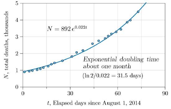
We thus started with total deaths, plotting them as in Figure \(\PageIndex{1}\). The number of deaths was not only increasing but accelerating, seemingly on an exponential course. The calculated doubling time was 31.5 days, not quite what U.S. Centers for Disease Control (CDC) had found earlier, but within reasonable correspondence. They estimated 15–20 days to double in one country and 30–40 in another (Meltzer et al., 2014).
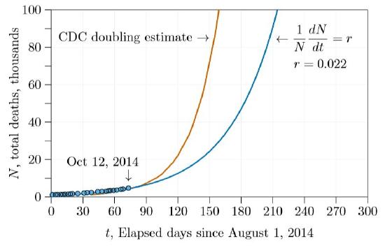
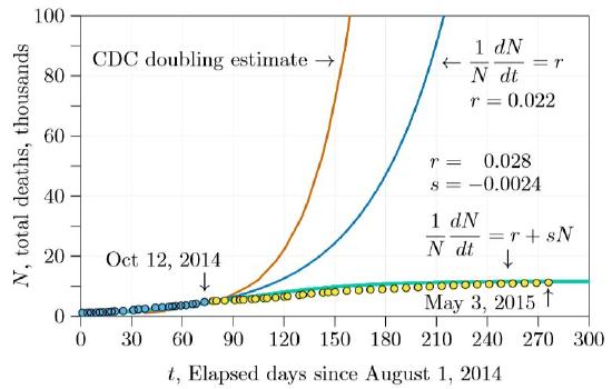
Calculating from these doubling times and extending for several more months results in the number of deaths shown in Figure \(\PageIndex{2}\). Before five months with the estimates we made during class (blue curve in the figure) and before three months with the earlier estimates (red curve), the number of deaths was predicted to exceed 100,000.
But there is a flaw in this approach. As shown by the calculations on bacteria and Darwin’s calculations on elephants (Chapter 3), exponential growth models cannot be extended very far. They can be quite accurate a limited number of time units in the future. But when applied to biological populations both exponential and orthologistic models inevitably fail when extended indefinitely. Actually, one view is that they do not really fail—they just warn that some other growth model will supplant them before populations grow too large.
| Days | Years | Total Deaths |
|---|---|---|
| 0 | 0.00 | 892 |
| 100 | 0.27 | 8,412 |
| 200 | 0.55 | 79,335 |
| 300 | 0.82 | 74,8267 |
| 400 | 1.10 | 7,057,440 |
| 500 | 1.37 | 66,563,800 |
| 600 | 1.64 | 627,811,000 |
| 700 | 1.92 | 5,921,330,000 |
| 710 | 1.94 | 7,411,030,000 |
In fact, assuming the unrestrained doublings of exponential growth is tantamount to assuming a disease will kill the entire world, with the only question being when. Table \(\PageIndex{1}\) shows the results of doubling at the rate illustrated by the blue curve in Figure \(\PageIndex{2}\), extended farther. At this rate the entire human population would be extinguished in less than two years!
Expected moderation. Of course, the entire human population will not be extinguished by a manageable disease. Draconian measures would be put in place long before— isolating those infected, closing borders, and more. In effect, the growth rate \(r\) will be moderated by strong negative social pressure, term \(s\).
When would such negative pressure appear in the data? Could it be seen early in the Ebola outbreak, when we and the students began watching? Because the basic disease equation is equivalent to the \(rsN\) model, we thought early trends might appear if we examined the data in terms of \(r\) and \(s\). The individual growth rate in deaths, \((1/N)dN/dt\), could be examined and plotted against the total number of deaths, \(N\). This is Figure \(\PageIndex{3}\), with the same data as Figure \(\PageIndex{1}\), just reformulated.
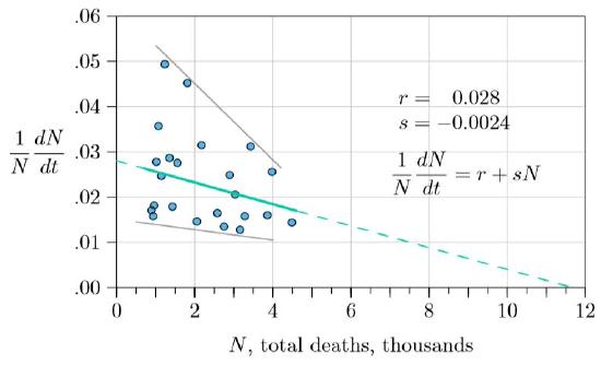
The data show quite a bit of noise, but with a clear downward trend, with the rate in the total number of new deaths decreasing as deaths increase. Both the upper and lower ranges of points are decreasing (gray lines). The green line through the averages (least-square regression line, solid, with \(r\) and \(s\) as shown in the figure) projects forward (dashed) to about 12,000 deaths before the outbreak would be over—an extensive human tragedy, but far below the straightforward projections of Figure \(\PageIndex{2}\).
If this decline in death rate was real, it was likely developing from more and more attention to moderating the disease—medical workers expanding hospitals, populations practicing more careful burials, governments cautioning only justified travel, and the like. When we made the projection of 12,000 in the fall of 2014, we had no certainty about what would happen; we were simply looking at the data, which showed not unrestrained exponential growth, but moderating growth instead.
The next step was to plug the \(r\) and \(s\) derived from the fitted curve and project forward six months or a year. This projection is shown in Figure \(\PageIndex{4}\). The green curve is the projection from \(r\,=\,0.028\) and \(s\,=\,−0.0024\). It is markedly different than the other two curves, leveling off early and reaching about 12,000 deaths. Also in the figure are three additional points of actual data, in yellow, not sufficiently advanced to tell which of the three curves—red, green, or blue—will be the real one.
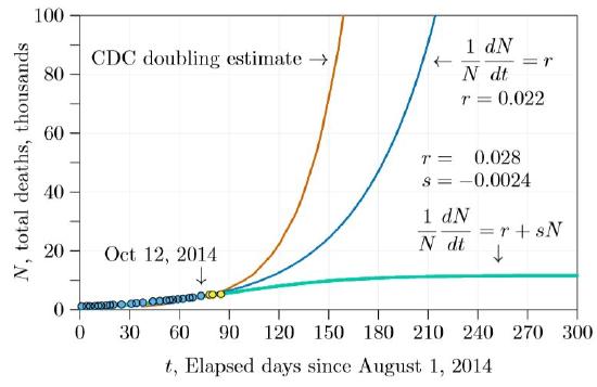
In only a few weeks, however, it became apparent that the \(r+sN\) curve was the most accurate. By the end of the winter semester (about day 140 in the graphs) it was clear that the outbreak was coming under control, and that the number of deaths was fairly close to our initial projection. After tracking the outbreak with our students through the winter and spring semesters, we could see how remarkable that early projection was (Figure \(\PageIndex{5}\)). Reading the data carefully early in the crisis gave an accurate projection of the outcome, from a simple model indeed!
Doubling times. This example provides a good place for us to reconsider doubling times, introduced with exponential growth. Recall that exponential growth is the infinitely thin dividing line between logistic and orthologistic growth, and has the property of a fixed “doubling time.” In other words, there is a specific time interval—call it tau (\(\tau\))—during which the population exactly doubles. In logistic growth the doubling time constantly decreases, while in orthologistic growth it constantly increases. Earlier the doubling time is shown to be the natural logarithm of 2 divided by r— \((ln2)/r\), or approximately \(0.693/r\). This is in years if \(r\) is measured per year, days if per day, an so forth.
Thus the doubling time for the exponential curve of Figure \(\PageIndex{1}\), with \(r\,=\,0.022\), is \(0.693/0.022\,=\,31.5\) days. The logistic growth of Figure \(\PageIndex{3}\) has no fixed doubling time. However, at all times there will be an “instantaneous doubling time,” which will hold approximately for a short time. In particular, near the very beginning of the outbreak—when \(N\) is close to 0—the growth rate is \(r+sN\,=\,r+s\,\cdot\,0\,=\,r\). For the Ebola data early in the outbreak, we found \(r\,=\,0.028\) and \(s\,=\,0.0024\). The Ebola doubling time, averaged over the countries in which it spread, therefore started out at \(0.693/r\,=\,0.693/0.028\,=\,25\) days. This is in accord with early estimates made by health organizations.
When we began following the outbreak, about 4.5 thousand deaths had occurred, meaning that the growth rate was \(r+sN\,=\,0.028−0.0024\,\cdot\,4.5\,=\,0.0172\), and the doubling time was \(0.693/0.0172\,=\,40\) days.
The doubling time continued to decrease until the outbreak was conquered and all deaths from Ebola ceased.
Caveats and considerations. There was some fortuity in the timing of our initial projection. Shortly after we started the death rate dropped, possibly from increased efforts following intense world-wide attention. Had we made the projection a few weeks later we would have seen two slopes and would have had to guess which would prevail. It turns out that the first slope prevailed, returning about 40 days after our initial projection. But we had no way to know this from the data at the time.
Our approach could also be criticized because the \(r+sN\) equation we used is a hybrid—a single equation trying to represent two different things, in this case infections and deaths. It is reasonable here to base the amelioration parameter s on the total number of deaths, since deaths were the parameter of world concern. Deaths influence social attention to the disease and efforts to control it. However, what sense is there in saying that deaths grow at rate \(r\), based on the total number of deaths thus far? Ebola can be transmitted to others shortly after death, but in general deaths do not cause new deaths. Infections cause new infections, which in turn cause new deaths. If \(N\) represents total deaths, it seems the equations should also have an \(I\) to represent infections, and some fraction of infections should result in deaths—as in this two-dimensional system of equations.
\[\frac{dI}{dt}\,=\,\beta\,I\,-\,\gamma\,I\,-\,\alpha\,I\,-\,sNI\]
\[\frac{dN}{dt}\,=\,\alpha\,I\]
The two dimensions are \(I\), the number of existing infections, and \(N\), the cumulative number of deaths. Infectivity is \(\beta\), the rate of recovery from infection is \(\gamma\), and the rate of death from the disease is \(\alpha\). These correspond to the notation in Figure 15.2.1. In addition, the term \(sN\) moderates the growth of the infection by representing all the cautions and infrastructure put in place against the disease as the number of deaths increased.
No factor like \(1−v−p\), representing the fraction of susceptible individuals, is needed to multiply the \(\beta\) term here, because both in the early stage and the outbreak the prevalence was low and there was no vaccine, so almost everyone was susceptible. And with this rapidly progressing disease the population remained almost constant, so births could be considered negligible. Equation is thus still a simplified equation.
As simplified as it is, however, Equation carries more parameters than can be perceived in the raw data. The death rate from the disease \(\alpha\), the recovery rate \(\gamma\), the infectivity \(\beta\), and even the number of infections \(I\), can only be discovered through the use of special research programs. But even at the beginning of an outbreak, and even for a poorly understood disease, there may be enough data to determine the doubling time for deaths from the disease, and how the doubling time is changing—enough data to determine \(r\) and \(s\), even if little more.
This is fortunate, because Equation can be reduced in dimension and approximated by the \(r+sN\) form. Without the amelioration term \(sNI\), the two dimensions are independent and growth of each is exponential, with \(N\) being the integral of \(I\). Because the integral of an exponential is still exponential, the two can be approximated by a single equation of one fewer dimension, with the amelioration term \(sNI\) reinstated. In this way, total deaths become a legitimate surrogate for infections in low-prevalence outbreaks, as in the present example of Ebola.
And as we noted, this gave an accurate projection on the course of a dread disease, from a very simple model indeed!