
Reading- Descriptive Statistics and Graphing
- Page ID
- 2846
Descriptive Statistics
Normal Distribution
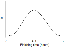
For many kinds of biological data, if the frequency (or number) of data points is plotted on the Y-axis, a bell-shaped curve may be produced such as the one shown below. Data sets that produce a bell-shaped curve are said to be normally distributed. For example, suppose that 10,000 runners finish a distance race. A few of the finishers will be among the fastest runners and a few will be the slowest. Most of the finishers will be in the middle. The plot below shows expected results for finishers of a marathon.
According to the Central Limit Theorem, the sums (or means) of random numbers are normally distributed. An example will illustrate this point. Suppose that we roll 5 dice and add the five numbers from the roll. The smallest number that we could get is 5 and the largest number that we could get is 30. We could then roll the dice again and sum all of the numbers for a second data point. If we repeated this a large number of times, the results would be normally distributed. A Java applet is available at the University of South Carolina website which will roll dice a large number of times and create a graph of the result. Go to this web page (http://www.stat.sc.edu/~west/javahtml/CLT.html) and try rolling 5 dice 10,000 times and observe the distribution. An example of results for 5 dice rolled 10,000 times is below.
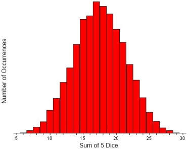
Notice that most of the numbers are in the range of 15 to 20 with very rolls producing 5 or 30. Repeat the procedure with 2 dice and notice that most rolls are 7 with relatively few 2s and 12s. Try rolling 1 die 10,000 times. Summing is not used and the data are not normally distributed.
Many kinds of biological data have a normal distribution as shown above. For example, we could plot the weights or height of people in a population or their scores on exams. A large sample size will likely show that the data are normally distributed. One reason is because many biological characteristics are due to more than one gene and the genes often act additively.
Central Tendency
Measures of central tendency are used to describe a "typical" number in a data set. There are different ways to find a typical number and there are advantages and disadvantages to each. Two commonly-used measures of central tendency are the mean and the median. These are described below.
Mean
The mean is the average. The mean of a group of numbers is obtained by adding the numbers and then dividing the sum by the total number of data. For example, suppose that a population biologist obtains the following population estimates for waterfowl in six lakes:
Data: 400, 200, 220, 210, 340, 250
The mean of the six numbers below is equal to the sum (1620) divided by the number of data points (6) = 270.
Median
The median is the middle observation. It is obtained by arranging the data in increasing (or decreasing) order. The number that is in the middle is the median.
Data: 27, 40, 3, 51, 34
Data arranged in ascending order: 3, 27, 34, 40, 51
The median for this data set is 34.
If there is an even number of data points, there will be two middle numbers. In this case, the value that is half-way between the two middle numbers is the median. This is equivalent to taking the mean of the two middle numbers.
Data: 400, 200, 220, 210, 340, 250
Data arranged in ascending order: 200, 210, 220, 250, 340, 400
The numbers 220 and 250 are both the middle numbers. The median is therefore the mean of 220 and 250. It is 235.
Which to use- Some Disadvantages of Each:
Mean – The mean gives a good representation of the data if the data are normally distributed. However, the mean is influenced by outliers, particularly if the number of data points is small. If there are outliers, the median (discussed below) may be a better because it is more immune to this sort of bias. For example, suppose that a population estimates for waterfowl in seven lakes are:
| 400 |
| 200 |
| 220 |
| 210 |
| 340 |
| 250 |
| 44,000 |
The last number in this data set does not seem to belong with the rest; it is an outlier. The typical lake seems to have approximately 200 to 400 birds but the mean for this data set is 6,517. The median (250) may be a better measurement of central tendency.
Median – The median is useful if there are outliers or if the data distribution is not normal (a bell shaped curve) as discussed above. However, the median may not be a representative measure of central tendency if the sample size is small. It is affected by fluctuations in sample data, particularly if the sample is small. For example, suppose that two samples are taken from a population as shown below:
1st sample: 1, 5, 8, 12, 13 Median = 8, Mean = 7.8
2nd sample: 1, 5, 6, 12, 13 Median = 6, Mean = 7.4
Notice that a slight difference in sample data produces a larger change in the median than in the mean.
With a small number of data points, it is possible that the median may not be a central number. In the following data set, the median is 0, which is not a representative number
52, 50, 48, 0, 0, 0, 0.
Presenting Data
Tables and graphs are convenient for presenting data. They present the data in an organized format, enabling the reader to find information quickly.
Tables
Tables should be numbered sequentially beginning with “Table 1.” Include a descriptive title. The title should enable the reader to understand the table without reading the rest of the document. When creating tables, be sure to state the units of all measurements. Some examples are minutes, milliliters, parts per million, etc.
Example
Table 1. Number of bird species observed in 10 different woodlots in Clinton County, NY on January 18, 2006. Each bird count was done by two observers over a 1-hour period beginning at 8:00 AM.
|
Size of Woodlot (ha) |
# Bird Species |
|
3.3 |
11 |
|
8 |
13 |
|
3.6 |
13 |
|
13 |
14 |
|
1.1 |
7 |
|
11.0 |
14 |
|
7.4 |
12 |
|
6.6 |
14 |
|
8 |
12 |
Graphs
Graphs, drawings, and other illustrations are called “Figures.” They should be numbered and titled just like tables.
The scale used on each axis should cover the values in the data set. For example, if you are graphing 52 to 87, start at 45 or 50 and go to 90 or 95.
Variables
The data in the graph below was obtained by measuring the heart rate of a runner while running at different speeds. As can be seen, when the runner ran faster, heart rate increased.
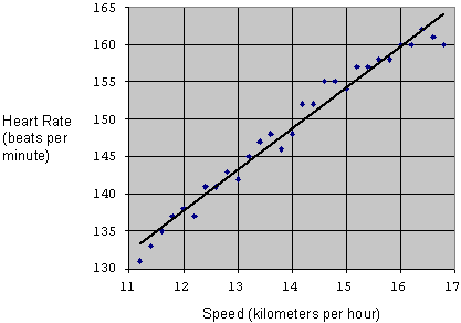
Heart rate and speed are both referred to as variables because their value changes; it is not fixed. It is possible that heart rate depends on speed, so it is called a dependent variable. Speed does not depend on heart rate; it is an independent variable.
Dependent variables should be plotted on the Y-axis (vertical axis). Independent variables should be plotted on the X-axis (horizontal axis).
Bar Graphs
Bar graphs are best when the data are in groups or categories.
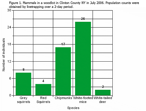
The data in the example below come from population counts of several different kinds of mammals in a woodlot in Clinton County, NY in July 2006.
Grey squirrel – 8
Red squirrels – 4
Chipmunks - 17
White-footed mice – 26
White-tailed deer – 2
A bar graph is best for these data because they are categories; it is not possible to have a data point that is between grey squirrels and red squirrels.
Line graphs
Line graphs are used when the data are continuous.
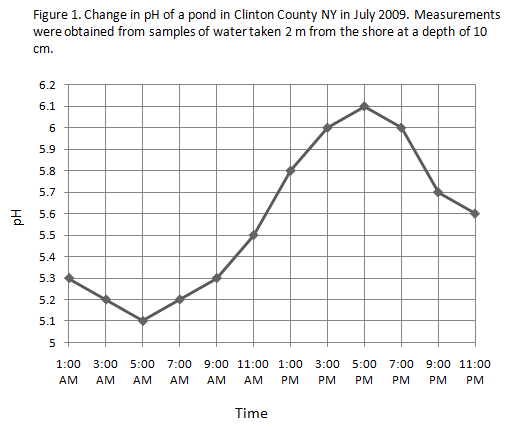
The data in the example below are pH measurements of an a pond in Clinton County, NY on 7/11/09. Samples of water were obtained every 2 hours beginning at 1:00 AM and ending at 11:00 PM.
1:00 AM – 5.3
3:00 AM – 5.2
5:00 AM – 5.1
7:00 AM – 5.2
9:00 AM – 5.3
11:00 AM – 5.5
1:00 PM – 5.8
3:00 PM – 6.0
5:00 PM – 6.1
7:00 PM – 6.0
9:00 PM – 5.7
11:00 PM – 5.6
A line graph is appropriate because the data are continuous. Although the researcher in this experiment did not measure the pH at 2:00 AM, it is possible that she could have done that. A line graph shows pH values for time periods that are between the times when samples were taken.
Scatter Plots
Scatter plots are useful to see if there is a relationship between two variables. It is not appropriate to connect the data points with a line because each data point is independent of the points next to it; the measurements were not taken in a sequential order. If the data points were connected with a line, an increase or decrease from one point to the next would not provide any useful information.
Suppose that a researcher wants to learn if there is a relationship between the size of the forest and the number of bird species that live in the forest. She collects the following data from different woodlots around Clinton County , NY in January 2006.
|
Size of Woodlot (ha) |
# Bird Species |
|
3.3 |
11 |
|
8 |
13 |
|
3.6 |
13 |
|
13 |
14 |
|
1.1 |
7 |
|
11.0 |
14 |
|
7.4 |
12 |
|
6.6 |
14 |
|
8 |
12 |
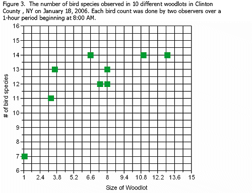
The points on the graph indicate that larger woodlots generally have more bird species.
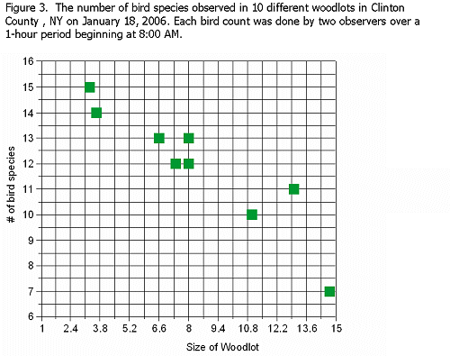
Suppose that the data collected produced the graph below instead of the one shown above. The graph below shows a negative relationship; larger woodlots have fewer bird species.
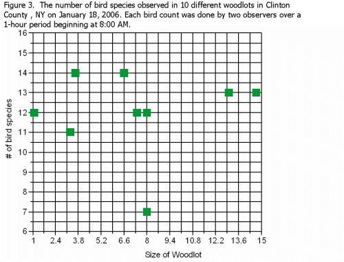
Suppose that the data collected produced the graph below instead of the ones shown in the previous two examples. The graph below shows that size of woodlot does not seem to be related to number of bird species.
Rounding and Significant Digits
It is often desirable to round numbers. For most purposes in this laboratory course, numbers should be rounded to 3 significant digits. Some examples below illustrate this concept.
The number 35,832,487 can be rounded to 35,800,000. We use the three digits that are furthest to the left; the rest become zeros. The number 35,852,487 becomes 35,900,000. If the number to the right of the 3rd digit is 5 or greater, the 3rd digit is rounded up. If it is less than 5, it is rounded down.
The number 2.4815 becomes 2.48. The number 2.4855 becomes 2.49.
Example
The table below shows the number 12753122 rounded to several different significant digits.
| Number of significant digits |
Number |
| 1 | 10000000 |
| 2 | 13000000 |
| 3 | 12800000 |
| 4 | 12750000 |
The table below shows the number 0.4382251 rounded to several different significant digits.
| Number of significant digits |
Rounded |
| 1 | 0.4 |
| 2 | 0.44 |
| 3 | 0.438 |
| 4 | 0.4382 |